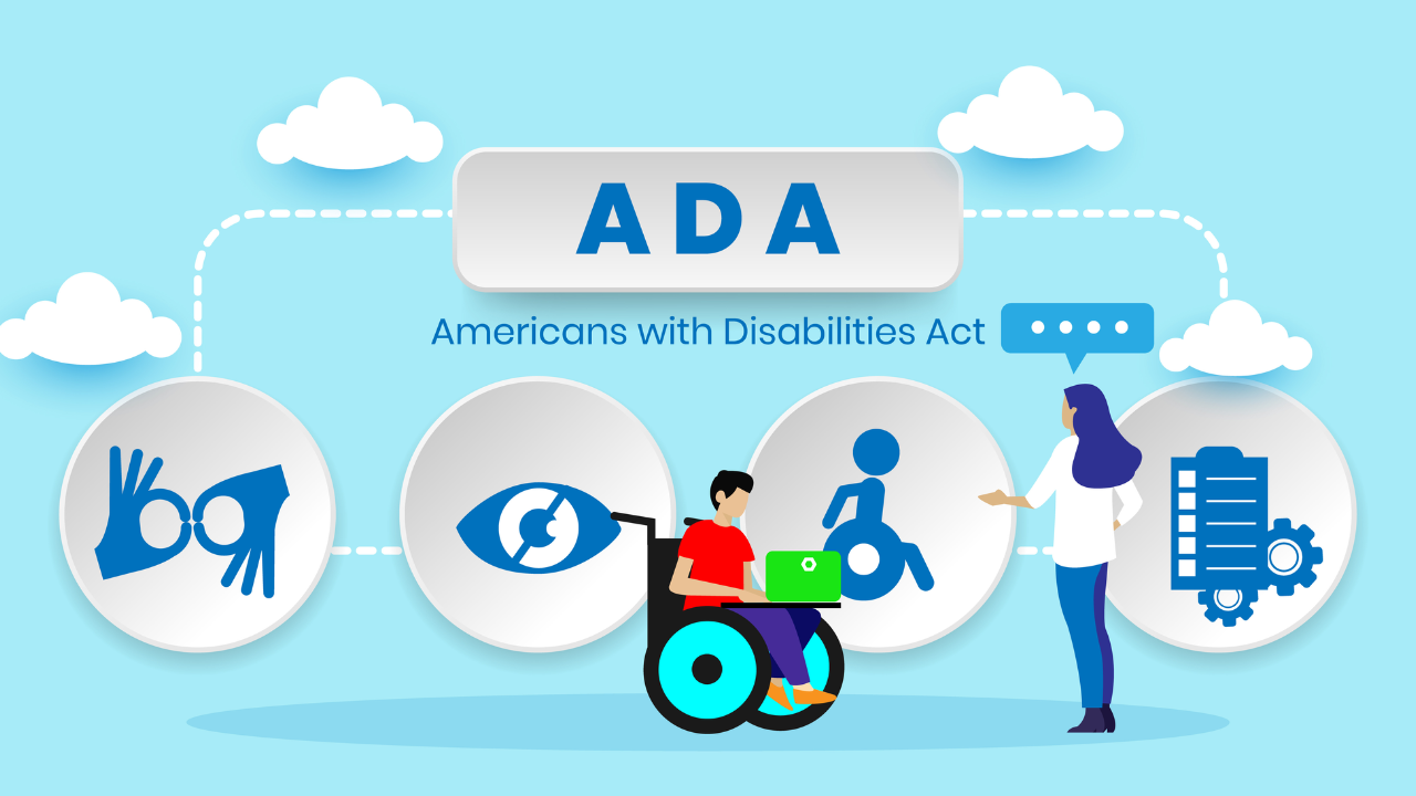
ADA Compliance Checklist for Ecommerce Businesses
Your online store needs to work for everyone. That includes the millions of people with disabilities who shop online every day.
ADA compliance for ecommerce isn't optional anymore. It's a legal requirement. More importantly, it's the right thing to do. When your website is accessible, you open your business to a much larger customer base.
The problem is that most ecommerce sites weren't built with accessibility in mind. Buttons that screen readers can't identify. Images without descriptions. Checkout processes that keyboard users can't complete. These barriers lock out potential customers and expose you to lawsuits.
At Inclusive Web, we help ecommerce businesses become accessible. We've seen what happens when stores ignore ecommerce accessibility and what happens when they embrace it. The difference is dramatic.
Let's walk through a practical checklist for ecommerce ADA compliance. These are the specific things you need to fix to make your online store accessible to everyone.
Understanding ADA Compliance for Ecommerce
The Americans with Disabilities Act requires businesses to provide equal access to people with disabilities. This applies to physical stores and increasingly to websites too.
Courts have ruled repeatedly that ecommerce websites count as places of public accommodation under the ADA. That means your online store must be accessible just like your physical location would need wheelchair ramps and accessible restrooms.
The legal standard for ecommerce compliance is WCAG 2.1 Level AA. These are technical web content accessibility guidelines that spell out exactly what makes a website accessible. Meeting these standards protects you legally and helps your customers practically.
Lawsuits over inaccessible websites have skyrocketed. Companies of all sizes are getting hit with demand letters and legal action. The average settlement costs tens of thousands of dollars, not counting the legal fees to get there.
But legal protection isn't the only reason to care about ecommerce ADA compliance. Accessible websites convert better. They work better on mobile devices. They rank higher in search results. Making your site accessible makes it better for everyone.
Website Navigation and Structure
People need to move around your site easily, whether they use a mouse, keyboard, screen reader, or other assistive technology.
Keyboard navigation is critical: Every function on your site must work with just a keyboard. No mouse required. This helps people who can't use a mouse due to mobility issues.
Test this yourself: Unplug your mouse and try to navigate your entire site using only the Tab key, Enter key, and arrow keys. Can you browse products? Add items to cart? Complete checkout? If not, you have work to do.
Skip navigation links help people avoid repetition: Screen reader users don't want to hear your entire header menu on every single page. Add a skip link at the top that jumps straight to the main content.
Heading structure needs to be logical: Use H1, H2, H3 tags in proper order. One H1 per page for the main title. H2 for major sections. H3 for subsections. Screen readers use these headings to understand page structure and let users jump between sections.
Menus need proper ARIA labels: ARIA stands for Accessible Rich Internet Applications. These are code attributes that help assistive technology understand what things are and what they do. Your dropdown menus, hamburger menus, and navigation elements need proper ARIA labels so screen readers can announce them correctly.
Breadcrumbs help people know where they are: Show the navigation path from the home page to the current page. This helps everyone orient themselves, especially people with cognitive disabilities.
Search functionality must be accessible: Your search bar needs a proper label. Search results need clear headings. Filters need to work with keyboards and screen readers.
Product Pages and Images
Product pages are where you make sales. They absolutely must be accessible.
Every image needs alt text: Alt text is the description that screen readers announce when they encounter an image. For product photos, describe what the product looks like. For decorative images, use empty alt text so screen readers skip them.
Write good alt text: Don't just say "product image." Say "black leather wallet with silver zipper and card slots." Be specific and helpful. This helps blind customers understand what they're buying.
Product images need zoom functionality that's accessible: Many ecommerce sites have image zoom on hover. That doesn't work for keyboard users or people using screen readers. Provide keyboard-accessible zoom controls.
Color can't be the only way you communicate information: If a product comes in five colors, don't just show colored circles. Add text labels with the color names. Some customers are colorblind and can't distinguish between certain colors.
Product videos need captions and transcripts: If you have video demonstrations, add captions for deaf customers. Provide a text transcript describing what happens in the video.
Size charts and specification tables need proper markup: Use real HTML tables with proper headers. This lets screen readers navigate the data logically. Don't just use an image of a table, which is completely inaccessible.
Customer reviews need to be accessible: Star ratings need text alternatives. Review forms need proper labels. Sorting and filtering options need to work with keyboards.
Forms and Checkout Process
The checkout process is where you close the sale. It's also where many accessibility problems show up. An inaccessible checkout means lost revenue and frustrated customers.
Every form field needs a clear label: Don't use placeholder text as the only label. Screen readers need actual label tags associated with input fields. The label should stay visible even after someone starts typing.
Error messages must be clear and helpful: When someone fills out a form wrong, tell them exactly what's wrong and how to fix it. Don't just turn the field red. Use text to explain the problem. Red doesn't mean anything to a colorblind person or someone using a screen reader.
Make error messages announce immediately: When a form error appears, screen readers should announce it right away. Use ARIA live regions to make this happen. Otherwise, users might not realize anything went wrong.
Required fields need clear indication: Use the word "required" in the label or right next to it. Don't rely only on asterisks or red text. Make it crystal clear which fields are mandatory.
Auto-complete should work properly: Browsers can auto-fill forms if you use the right HTML attributes. This helps everyone but especially people with cognitive disabilities who struggle with typing.
Time limits are problematic: If your checkout has a timer for cart reservation, give people a way to extend it. Some customers need more time to complete forms due to disabilities. Forcing speed creates barriers.
Payment forms need extra attention: Credit card fields must be clearly labeled. CVV codes need explanations. Expiration dates need accessible date pickers. Don't make people hunt for information about where to find their CVV.
Confirmation pages need clear structure: After purchase, provide a clear confirmation with proper headings and structure. Send an email confirmation too, which is more accessible than trying to print a web page.
Interactive Elements and Functionality
Modern ecommerce sites have lots of interactive accessibility features. Carousels, modals, filters, sorting options. All of these need to be accessible.
Carousels and sliders need keyboard controls: Provide previous and next buttons that work with keyboards. Add a pause button so content isn't constantly moving. Auto-rotating carousels are terrible for accessibility.
Modal windows must trap focus: When a modal opens, keyboard focus should move into the modal and stay there until it closes. Users should be able to close the modal with the Escape key. When it closes, focus should return to wherever it was before.
Dropdown filters need proper markup: Product filter dropdowns must work with keyboard navigation. Screen readers need to announce how many options are selected. Clear filter buttons must be keyboard accessible.
Autocomplete search needs careful implementation: As people type in your search box, suggestions appear. Make sure keyboard users can navigate those suggestions. Screen readers need to announce when suggestions appear and update.
Add to cart buttons need clear feedback: When someone clicks add to cart, give clear confirmation. Don't just make a cart icon jiggle. Use text to confirm the item was added. Announce it to screen readers using ARIA live regions.
Quantity selectors must be accessible: Those plus and minus buttons for changing quantities need to work with keyboards. Screen readers need to announce the current quantity and when it changes.
Wishlist and compare features need proper labels: Buttons to add products to wishlists or comparison tools must clearly state what they do. Icons alone aren't enough.
Color Contrast and Visual Design
Good visual design isn't just about looking pretty. It's about making sure everyone can read and use your content.
Text contrast matters hugely: Your text needs sufficient contrast against its background. WCAG requires a contrast ratio of at least 4.5:1 for normal text and 3:1 for large text. Use a contrast checker tool to verify your color combinations.
Light gray text on white backgrounds fails contrast requirements. Pale colors fail. Test every text color you use against every background color it appears on.
Don't rely on color alone: If you use red text to show errors and green text to show success, also use words and icons. Some people can't distinguish red from green.
Links need to be visually distinct: Underline your links or make them bold. Don't just change the color, because colorblind users might not notice. When a link gets keyboard focus, show a clear focus indicator.
Focus indicators must be visible: When someone tabs through your page, there should be a clear outline or highlight showing which element has focus. Don't remove the default focus outline without replacing it with something equally visible.
Text must be resizable: People should be able to zoom your page to 200% without breaking the layout or causing horizontal scrolling. Test this in your browser. Some users need larger text to read comfortably.
Avoid text in images: If information is part of an image, screen readers can't access it. Use real text styled with CSS instead. If you must use text in images, include all that text in the alt description.
Mobile Accessibility
Most ecommerce traffic comes from mobile devices. Your mobile site or app needs to be just as accessible as your desktop site. Ensuring mobile accessibility to make your site user-friendly.
Touch targets need adequate size: Buttons and links need to be large enough to tap easily. WCAG recommends at least 44x44 pixels. This helps everyone but especially people with motor disabilities or large fingers.
Spacing between interactive elements prevents mistakes: Don't cram buttons close together. Leave enough space that people don't accidentally tap the wrong thing.
Mobile forms need careful design: Use the right input types so mobile keyboards show appropriate keys. Type="tel" for phone numbers. Type="email" for email addresses. This makes forms faster and easier to complete.
Hamburger menus must be accessible: Your mobile menu needs proper ARIA labels. The button to open it needs to announce its purpose. When the menu opens, keyboard focus should move into it.
Pinch to zoom must work: Don't disable pinch-to-zoom in your viewport meta tag. People need to be able to zoom in on content that's too small.
Testing Your Ecommerce Compliance
Making your site accessible requires ada compliance testing. You can't just assume you got it right.
Use automated testing tools: Tools like WAVE, aXe, or Lighthouse catch many accessibility issues automatically. Run these regularly. They'll find missing alt text, contrast problems, and structural issues.
Test with a keyboard only: Spend 30 minutes navigating your entire site without touching your mouse. Can you complete a purchase? If not, you have keyboard accessibility problems.
Use a screen reader: NVDA on Windows or VoiceOver on Mac are free screen readers. Try shopping on your site with your eyes closed using only the screen reader. It's eye-opening.
Hire people with disabilities to test: Automated tools catch maybe 30% of accessibility problems. Real users with disabilities find the rest. Their feedback is invaluable.
Test on mobile devices: Use real phones and tablets. Try completing purchases on small screens with just your thumbs.
Check your third-party tools: Your chat widget, payment processor, and other embedded tools need to be accessible too. Test them specifically.
Maintaining ADA Compliance Over Time
Ecommerce ADA compliance isn't a one-time fix. It's an ongoing commitment.
Train your team: Everyone who works on your website needs basic accessibility training. Developers, designers, content creators, product managers. If they don't know accessibility requirements, they'll keep introducing problems.
Build accessibility into your process: Check for accessibility issues before launching new features. Include accessibility in your definition of done. Make it part of your regular workflow.
Monitor for issues: Run automated tests regularly. Watch for new accessibility lawsuits in your industry. Stay aware of changing standards and requirements.
Have an accessibility statement: Create a page that explains your commitment to accessibility, lists any known issues you're working on, and provides a way for users to report problems. This shows good faith and can help with legal defense.
Keep improving: Accessibility standards evolve. Technology changes. Your site changes. Regular reviews and updates keep you compliant and keep your site working for everyone.
Making Your Store Accessible Matters
ADA compliance for ecommerce protects you legally, but it does so much more. Accessible stores serve more customers. They provide better user experiences. They convert better. They rank higher in search results.
Around 26% of Americans have some form of disability. That's a huge market you're potentially excluding with an inaccessible website. Making your store accessible isn't about checking boxes. It's about running a better business.
At Inclusive Web, we specialize in making ecommerce sites accessible. We audit sites, fix accessibility problems, and help teams maintain ecommerce compliance over time. We've helped hundreds of online stores become accessible.
Don't wait for a lawsuit to start caring about accessibility. Don't lock out customers who want to buy from you. Take action now to make your ecommerce site work for everyone.
Need help with your ecommerce ADA compliance? We'll audit your site, identify problems, and create a plan to fix them. Reach out to Inclusive Web today and let's make your online store accessible to every customer who wants to shop with you.
Have Questions?
We Are Inclusive Web
We work with our clients to simplify digital accessibility to ensure your web and digital applications are ADA compliant and accessible to all your users. If you’d like to talk about your digital accessibility, you can email us at matthew@inclusiveweb.co, leave us a note here, or schedule a call here to discuss. Let’s make the web inclusive to all!