Accessibility Resources
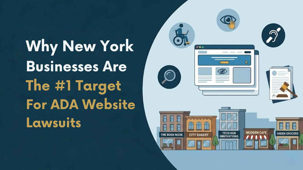
Why New York Businesses Are the #1 Target for ADA Website Lawsuits
New York has quietly become the most active state in the country for ADA website lawsuits. Owners of dental practices, retail brands, restaurants, law firms, and small service businesses are receiving demand letters and federal complaints for accessibility issues most never realized existed on their site. Many assumed ADA enforcement only applied to wheelchair ramps and storefront entrances. In reality, websites are now the primary battleground, and New York is where most of the fight is happening. For business owners who want to understand their exposure before a plaintiff's firm does, the web accessibility services for New York businesses page outlines what a proper risk review actually covers.
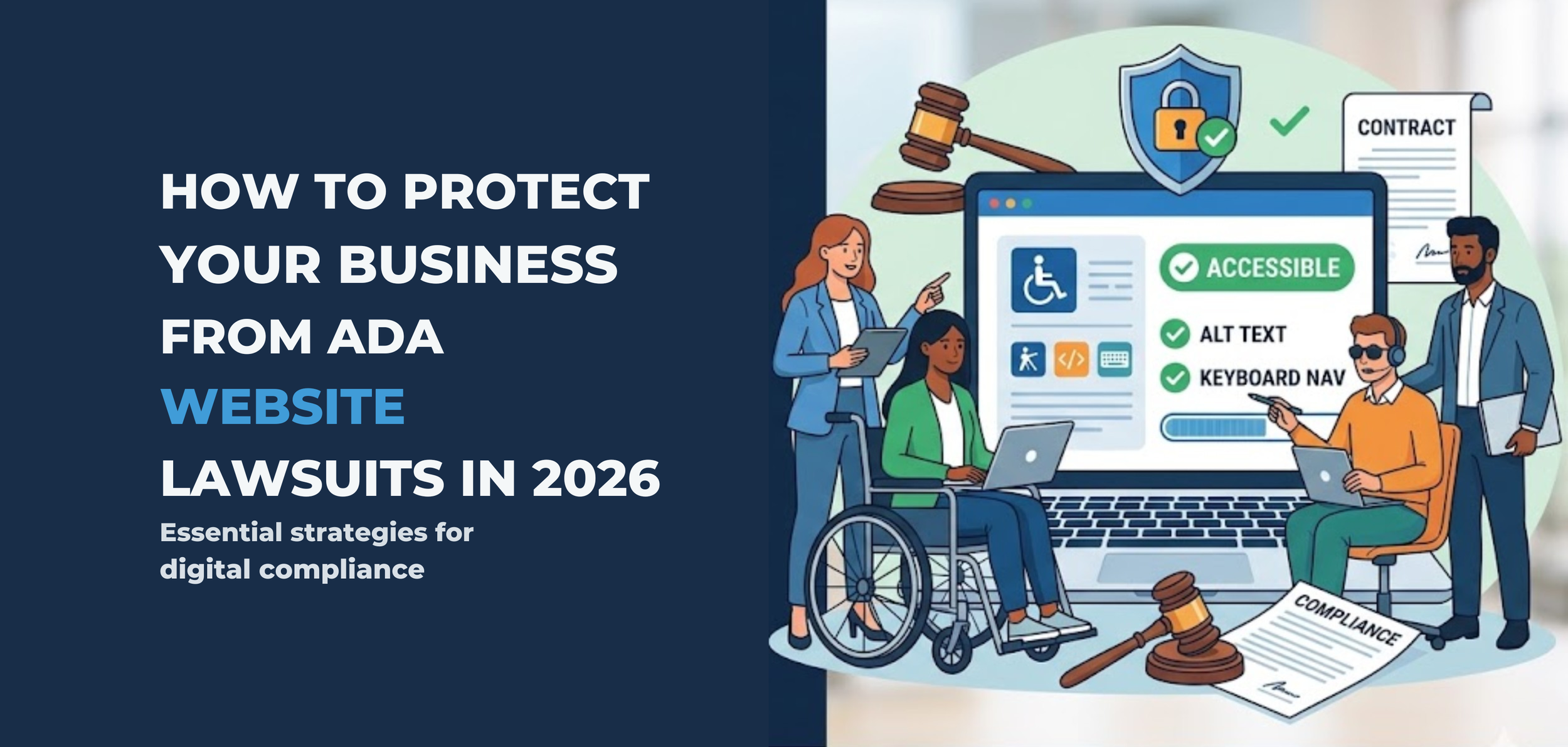
How to Protect Your Business From ADA Website Lawsuits in 2026
The ADA lawsuit wave isn't slowing down. It's accelerating. In 2026, plaintiff law firms have refined their screening processes, courts have reinforced that the ADA applies to websites, and the average mid-sized business is more exposed than ever — most of them don't even know it.
If your website isn't accessible to people with disabilities, you're not just risking a lawsuit. You're inviting one.
Here's what every business owner in the US needs to understand about ADA lawsuit risk for business owners — and exactly what to do about it before a demand letter shows up in your inbox.
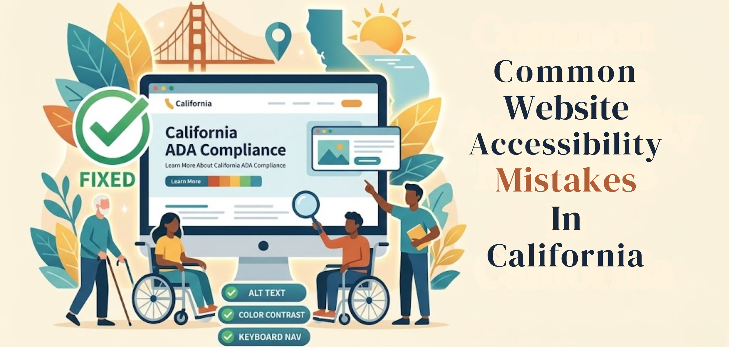
Common Website Accessibility Mistakes In California
A business website should work for everyone. That sounds simple, but many sites still create problems for people with disabilities. A page may look clean and professional yet still be hard to use with a screen reader, keyboard, captions, or a clear page structure. When that happens, users are blocked from information, services, and basic tasks. This is where Digital Accessibility Compliance California becomes important—helping businesses identify gaps early and take the right steps to fix them before they turn into bigger issues
This matters even more in California. The U.S. Department of Justice says businesses open to the public must make the goods and services they offer online accessible to people with disabilities. California also has strong civil rights laws, including the Unruh Civil Rights Act, which can increase legal pressure when access barriers are ignored.
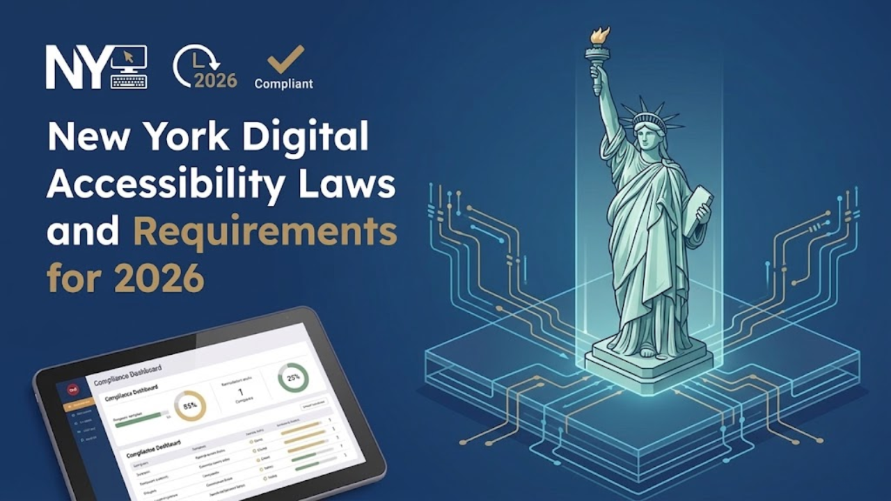
New York Digital Accessibility Laws and Requirements for 2026
New York leads the entire United States in ADA website lawsuits. Not by a little.
In the first half of 2025, New York accounted for 31.6% of all ADA digital accessibility lawsuits filed nationally - 637 cases in six months. In the middle of this growing concern around web accessibility New York, and here is the detail most businesses miss: 41% of those cases were repeat filings against companies already sued before. Getting hit once and doing nothing does not close the case - it marks you as a target.
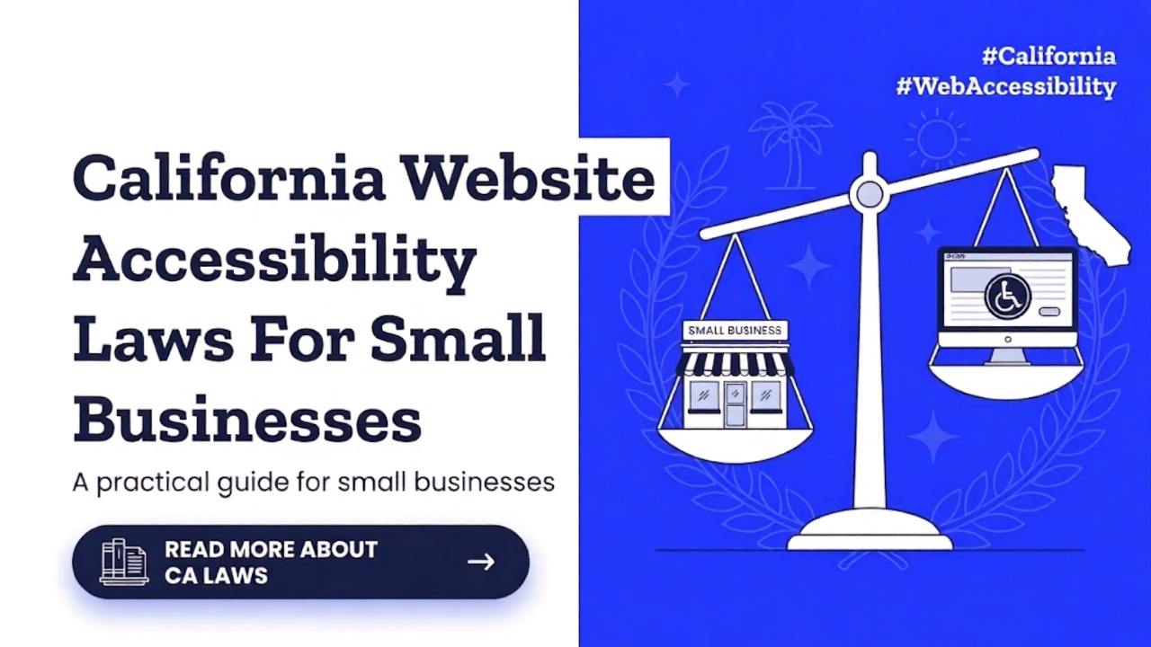
California Website Accessibility Laws For Small Businesses
A small business website is now part of the customer experience. People use it to read menus, book appointments, buy products, fill out forms, and contact support. When a site is hard to use with a screen reader, keyboard, captions, or a clear structure, some people are shut out. That is why website accessibility matters. It is not only a design issue. In California, it can also become a legal issue under both federal and state law, making California accessibility an important concern for business owners.
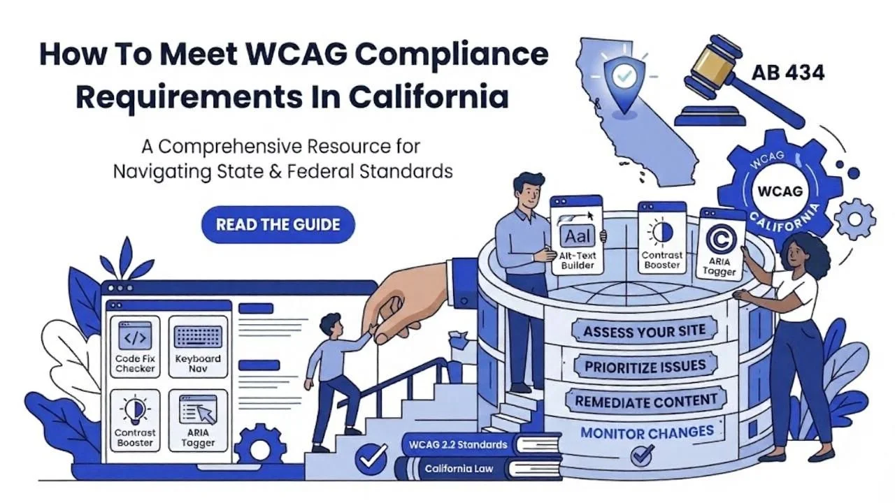
How To Meet WCAG Compliance Requirements In California
Website accessibility is now a basic part of doing business online. In California, it matters for legal reasons, customer experience, and everyday usability. Many business owners hear terms like WCAG, ADA, and accessibility law, but they are not always sure what those terms mean in practice. especially when it comes to california accessibility requirements. This article explains the basics in a simple way and shows how to move toward better compliance without getting lost in technical language.
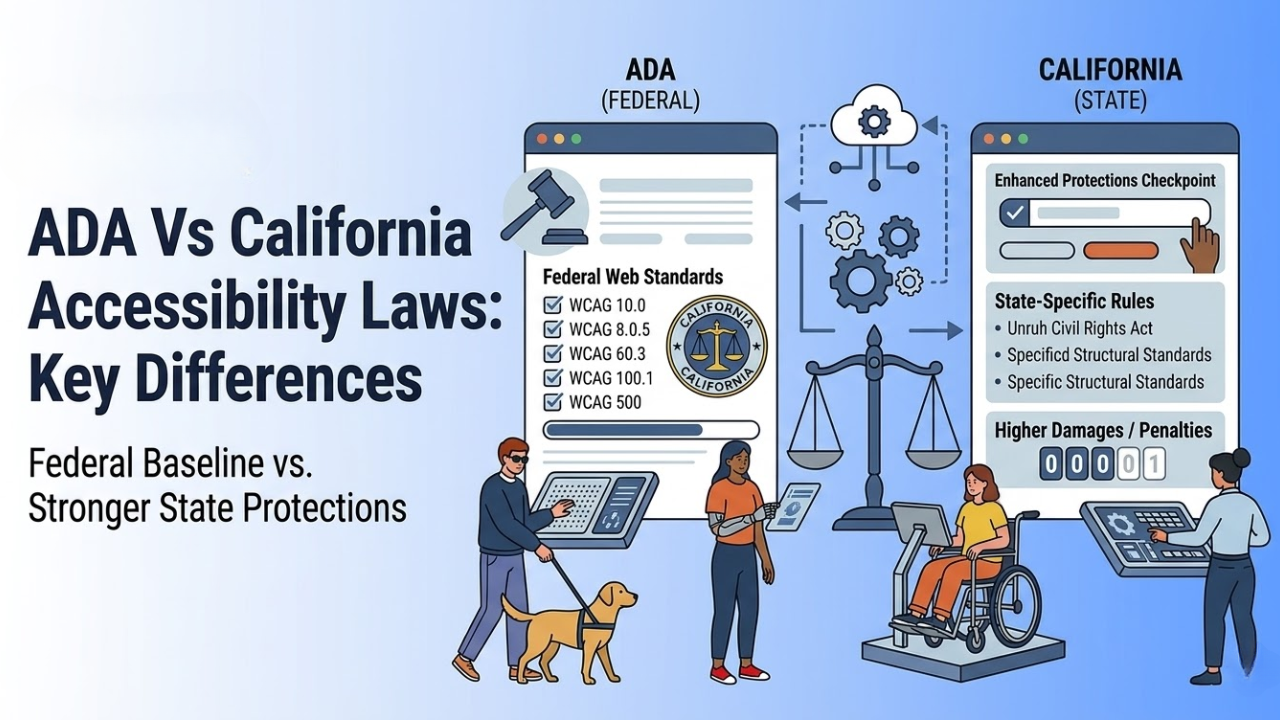
ADA Vs California Accessibility Laws: Key Differences
Many business owners think the ADA is the only law they need to know about accessibility. That is not true in California. Federal law matters, but California has its own rules and civil rights laws that can make the legal picture broader and, in some cases, tougher for businesses.
That is why understanding ADA vs California accessibility laws is important for any company with a physical location, a website, or both.
This topic can feel confusing because people often mix legal duties, design standards, and best practices into one conversation. The easiest way to understand it is to separate the layers. The ADA is the main federal disability access law. California then adds state laws, state enforcement, and state-level rights that can go beyond the federal baseline in some situations.
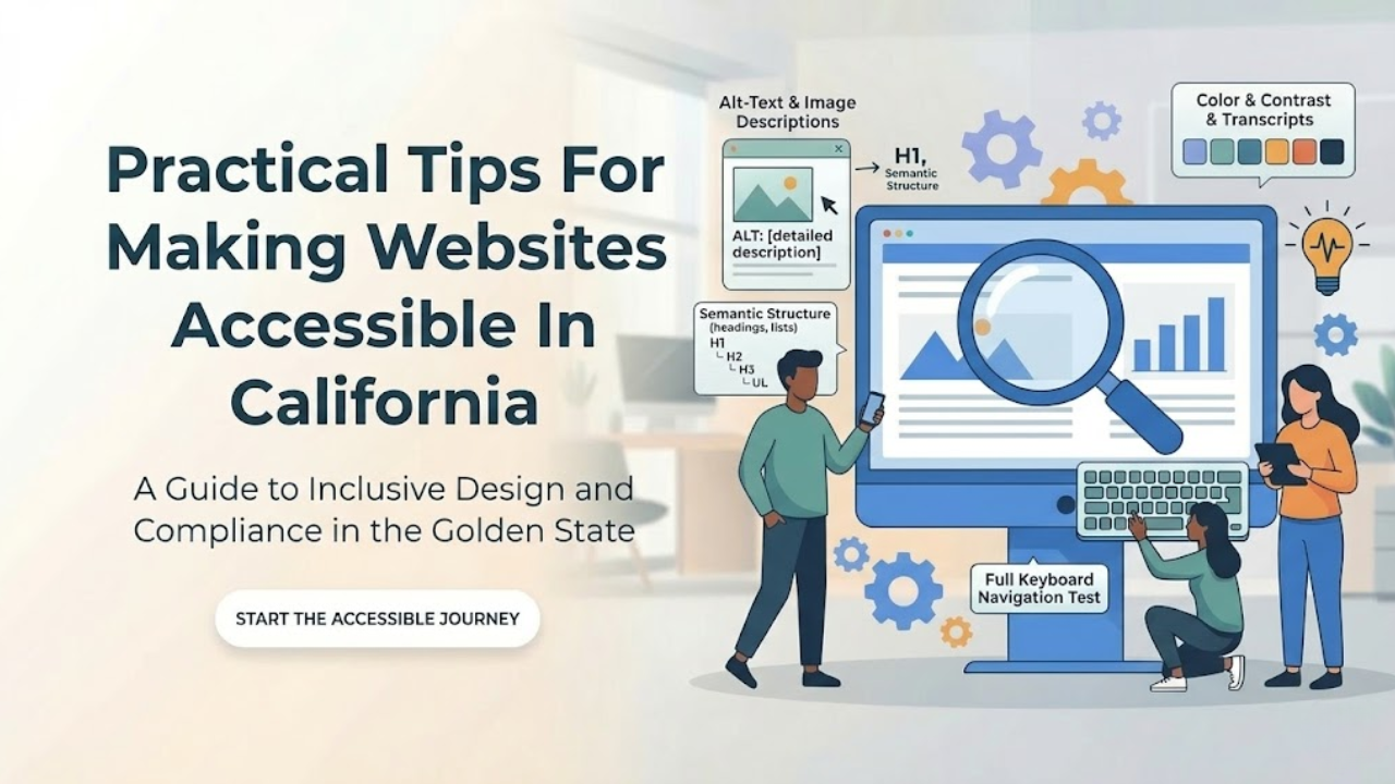
Practical Tips For Making Websites Accessible In California
Website accessibility is not a side task anymore. It is part of good web design, good customer service, and good risk management. In California, it matters even more because businesses are expected to give people with disabilities equal access to online services. Federal ADA guidance says businesses open to the public must make sure their online goods, services, and programs are accessible, and digital accessibility compliance California is an important part of meeting these expectations, while California state accessibility materials point to WCAG 2.2 Level AA and the Unruh Civil Rights Act as key standards in this space.
Digital Accessibility Compliance California: Full Guide 2026
Digital access is now a basic part of doing business and serving the public. People use websites, mobile apps, online forms, PDFs, payment portals, and service dashboards every day. If those tools are hard to use with a screen reader, keyboard, captions, Zoom, or voice control, many users are blocked from equal access.
That is why this topic matters in 2026. Digital Accessibility Compliance California is becoming increasingly important because California has state rules for public entities, and federal disability law also affects digital access. At the same time, businesses in California face real legal risk when their digital services create barriers for people with disabilities.
Common Accessibility Mistakes In Mobile Banking User Experience
Mobile banking should feel simple. A person should be able to check a balance, pay a bill, review a transaction, or lock a card without confusion. But many banking apps still create barriers that make basic tasks harder than they need to be. This is why the idea of accessible banking has become more important for financial institutions that want their apps to work well for everyone.
Some of those barriers are obvious. The buttons are too small. Text is too light. Labels are missing. Others are harder to notice. A timeout ends a session too fast. A screen reader reads a chart with no useful meaning. A login step depends too much on memory or drag-and-drop actions. These are not small details.
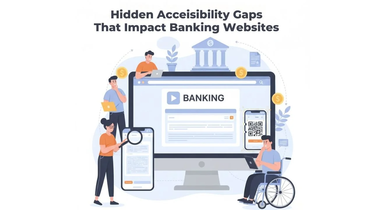
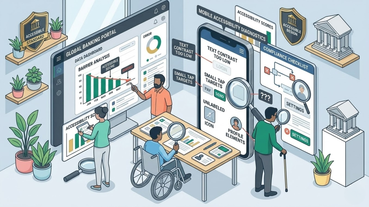
Hidden Accessibility Gaps That Impact Banking Websites
Online banking is now the main way people manage money. Many people no longer visit branches. They check balances on a phone. They pay bills from a laptop. They send money to their families in minutes. This convenience is helpful. But it also brings a new problem. If a banking website is hard to use, some customers get blocked from basic financial tasks.
Many banks think their websites are accessible. They may run a quick scan. They may fix a few visible issues. They may add an accessibility tool. Then they assume the problem is solved. But real accessibility is not always obvious. A website can look fine and still be difficult for many users. The biggest issues are often hidden inside forms, pop-ups, menus, and mobile screens. These are Hidden accessibility gaps in banking websites. They can quietly create real harm.
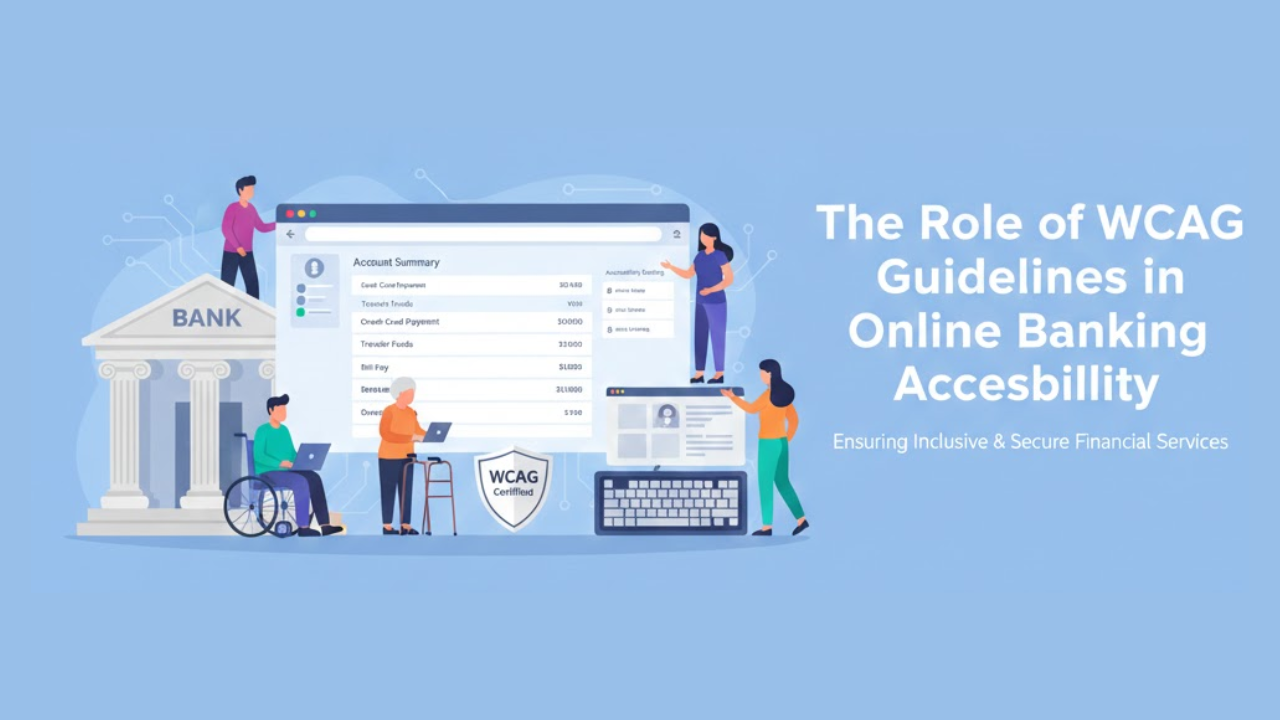
The Role of WCAG Guidelines in Online Banking Accessibility
Online banking is now part of everyday life. People check balances in the morning. They pay bills at night. They transfer money while traveling. Many customers depend fully on websites and mobile apps to manage their finances. Because of this, online banking must work for everyone.
Some users cannot see clearly. Some cannot hear audio. Some cannot use a mouse. Others may process information more slowly. If online banking does not support these needs, it creates barriers. Those barriers can stop people from accessing their own money.
This is where WCAG guidelines become important. WCAG gives clear rules for building websites that everyone can use. In this article, you will understand what WCAG is, why it matters in banking, and how it shapes Online banking accessibility features in real ways.
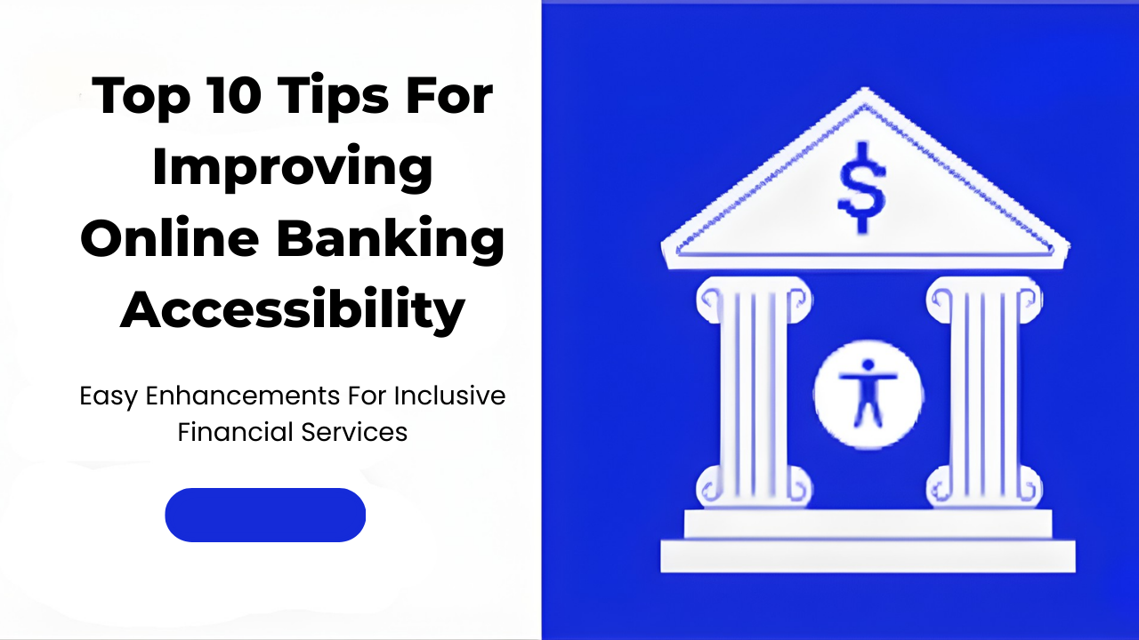
Top 10 Tips for Improving Online Banking Accessibility Features
Online banking is where real life happens now. People pay rent, send money to family, check refunds, and track spending from a phone screen. For many customers, the website or app is the bank. That is why accessibility cannot be “nice to have.” If someone cannot log in, read a statement, or confirm a transfer, the service is not doing its job.
Accessibility means this: the site works for people with different needs and different abilities. Some users rely on screen readers. Some can only use a keyboard. Some need larger text, clearer colors, or simpler steps. When those needs are ignored, customers get stuck. When they are supported, customers feel in control.
Below are ten practical tips that make a real difference. They are written for teams who want clear actions, not vague advice. The focus is on real-world online banking accessibility tasks, such as signing in, paying bills, transferring funds, and reviewing account activity.
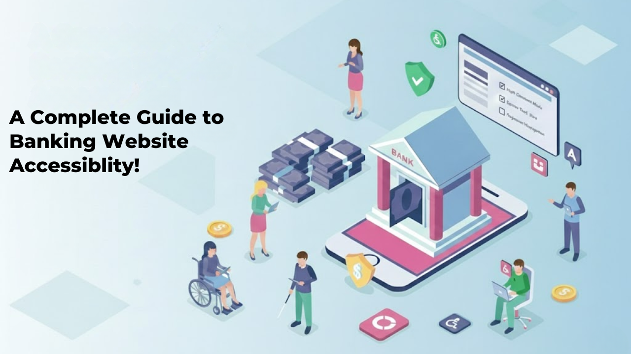
A Complete Guide to Banking Website Accessibility!
Banking is part of everyday life. People check balances, pay bills, transfer money, and apply for loans online. Many customers rarely visit a physical branch. They depend on websites and mobile apps to manage their finances. Because of this, digital access must work for everyone. If a banking website is hard to use for someone with a disability, that person may lose access to essential services. That is not acceptable.
This complete guide to banking accessibility explains what accessibility means in simple terms. It also explains why it matters and how banks can improve their digital platforms step by step. The goal is clear. Every customer should be able to use online banking without barriers.
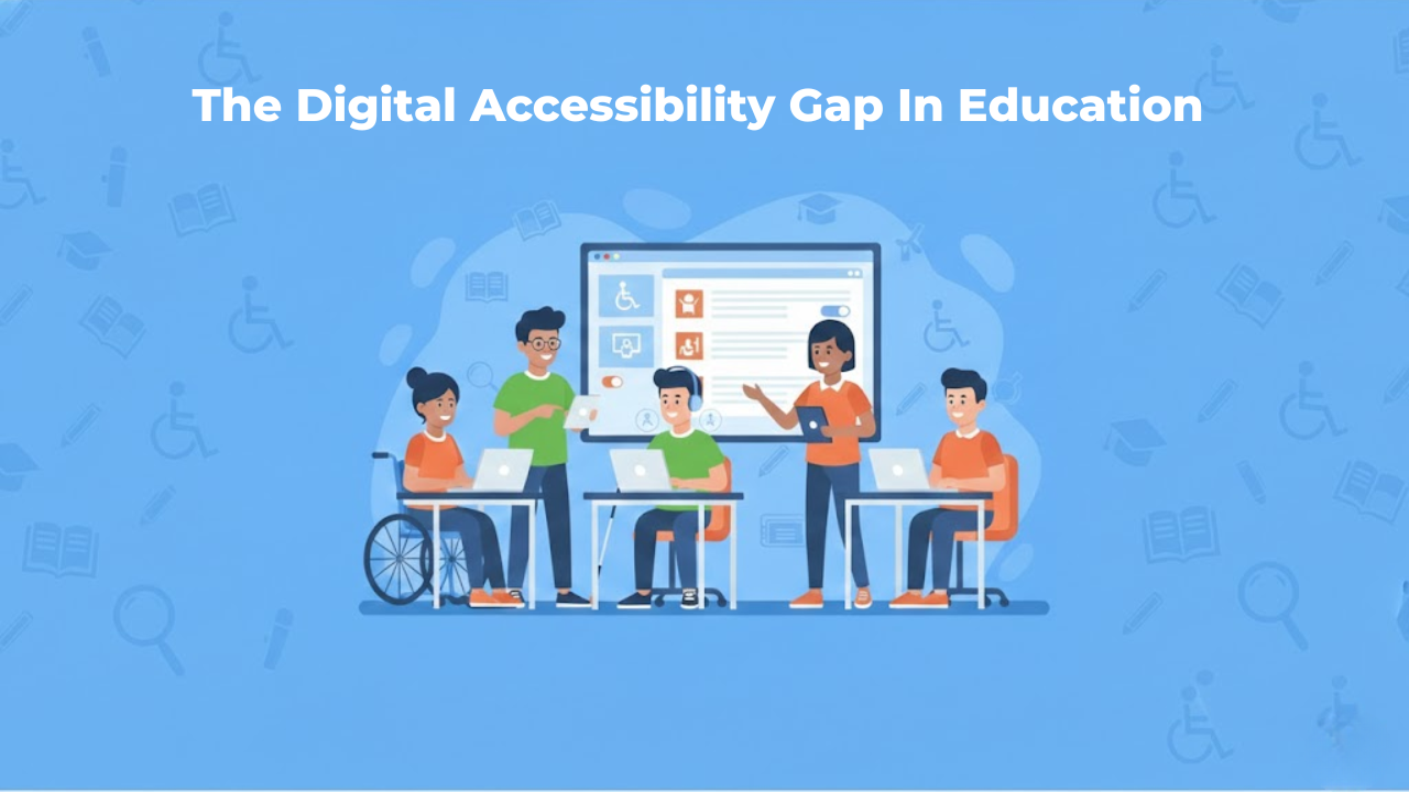
The Digital Accessibility Gap In Education Is Growing Fast
Education has moved online faster than schools could plan for. raising new questions about the accessibility of education. Classes now depend on websites, learning platforms, PDFs, videos, and apps. That shift helps many students, but it also leaves others behind.
When a student cannot read a worksheet because it is an image, that student is blocked. When a video has no captions, that student loses information. When a quiz does not work with a keyboard, the student cannot finish the test.
These are not rare edge cases. They are everyday barriers that add up fast.
One reason this is getting worse is that the web itself is still full of accessibility failures. In WebAIM’s Million report, 95.9% of the top one million home pages had detectable WCAG failures. That tells us something important: if the broader web struggles, education systems that rely on the same tools and habits will struggle too.
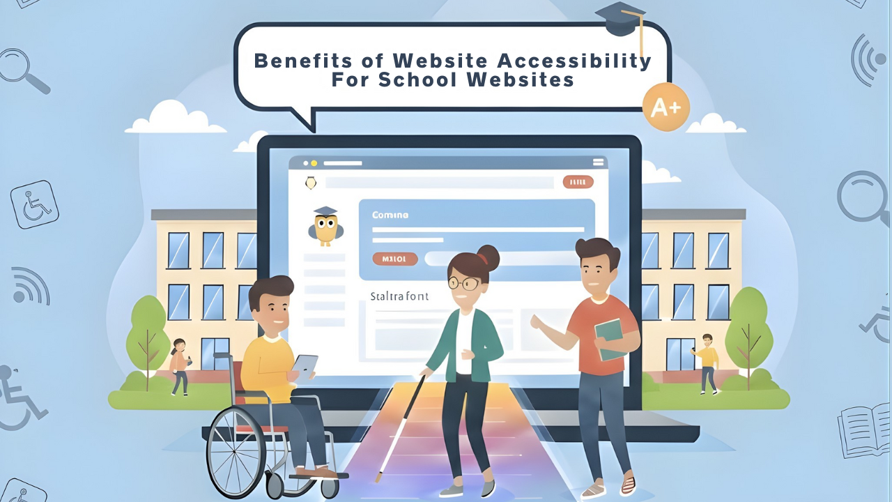
Benefits Of Website Accessibility For School Websites
School websites are no longer just online notice boards. They are where families enroll students, check calendars, read updates, download forms, and find support services. They are also where students access learning links, announcements, and resources that shape their day-to-day experience.
Because of this, a school website has to work for everyone. That includes people who use screen readers, people who cannot use a mouse, people who need captions, and people who need clear layouts to understand information without stress.
Website accessibility is the practice of ensuring your online content can be used by as many people as possible.
This article explains the real, practical benefits of Digital Accessibility in Education websites. It also describes how accessibility connects to legal expectations, common barriers, and simple improvements that make a big difference.
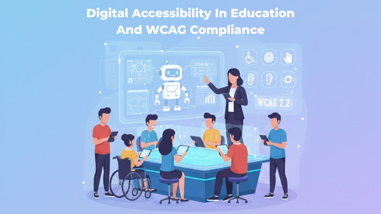
Digital Accessibility In Education And WCAG Compliance
Digital learning has become normal in schools, colleges, and universities. Students attend classes online, submit assignments through portals, watch recorded lectures, and take assessments inside learning systems. Even parents and staff depend on online tools for communication, enrollment, scheduling, payments, and support.
But here is the truth: digital education is only effective when everyone can use it. If a student cannot read a PDF with a screen reader, cannot navigate a portal with a keyboard, or cannot understand a video without captions, the learning experience becomes unfair and stressful. This is precisely why digital accessibility matters in education.
Digital accessibility means that online learning content and tools are designed so that people with different abilities can use them without barriers. It is not just a technical requirement. It is part of equal access, inclusive learning, and good educational design.
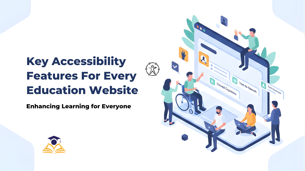
Key Accessibility Features Every Education Website Needs
Education websites are no longer just “nice to have” tools. They are where people learn, enroll, pay fees, find help, and stay informed.
And many people depend on them in ways we do not always see.
In the United States, 7.5 million students ages 3–21 were served under IDEA in the 2022–23 school year.
That is one reason accessibility in education matters so much. If a website blocks someone from reading a lesson, filling a form, or finding support, it can block real learning.
This article explains what to build and what to fix to improve accessibility.
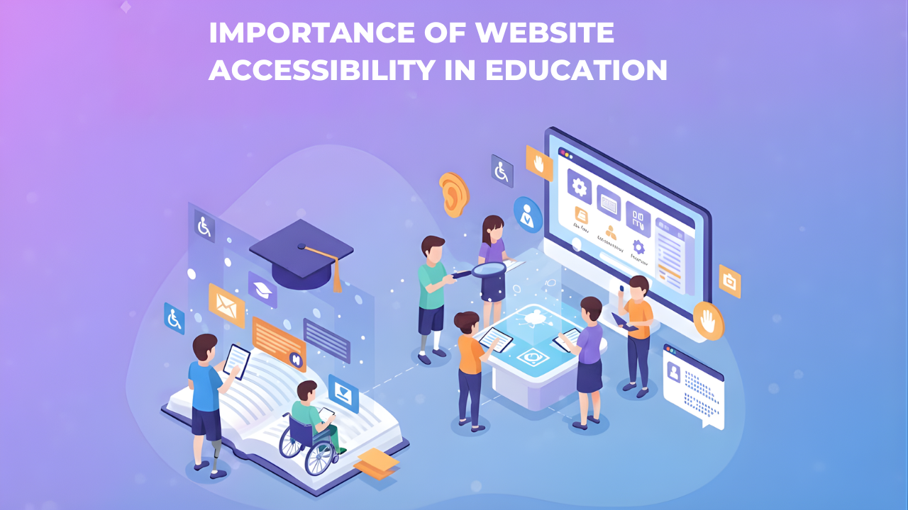
Importance of Website Accessibility in Education: A Full Guide
Website accessibility in education means everyone can use the school or college website, regardless of their abilities or the device they use. A student using a screen reader should be able to access course materials just as easily as a student using a mouse. A parent on an old phone should be able to check their child's grades without barriers.
This matters more in educational settings than almost anywhere else. Schools and colleges serve entire communities with vastly different abilities, devices, and technical skills. When an educational website isn't accessible, it blocks students from learning and families from staying informed.
This blog focuses on the real value and impact of accessibility. You'll understand why accessibility in education goes far beyond legal compliance and how it creates better experiences for everyone in your educational community.

ADA Compliance Checklist for Ecommerce Businesses
Your online store needs to work for everyone. That includes the millions of people with disabilities who shop online every day.
ADA compliance for ecommerce isn't optional anymore. It's a legal requirement. More importantly, it's the right thing to do. When your website is accessible, you open your business to a much larger customer base.
The problem is that most ecommerce sites weren't built with accessibility in mind. Buttons that screen readers can't identify. Images without descriptions. Checkout processes that keyboard users can't complete. These barriers lock out potential customers and expose you to lawsuits.