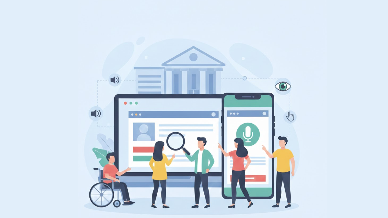
Top 10 Tips for Improving Online Banking Accessibility Features
Online banking is where real life happens now. People pay rent, send money to family, check refunds, and track spending from a phone screen. For many customers, the website or app is the bank. That is why accessibility cannot be “nice to have.” If someone cannot log in, read a statement, or confirm a transfer, the service is not doing its job.
Accessibility means this: the site works for people with different needs and different abilities. Some users rely on screen readers. Some can only use a keyboard. Some need larger text, clearer colors, or simpler steps. When those needs are ignored, customers get stuck. When they are supported, customers feel in control.
Below are ten practical tips that make a real difference. They are written for teams who want clear actions, not vague advice. The focus is on real-world online banking accessibility tasks, such as signing in, paying bills, transferring funds, and reviewing account activity.
1: Rewrite the Words People Actually See
Most accessibility problems start before code. They start with unclear words.
Banking pages often use language that sounds official but feels cold and confusing. People do not want “authentication failed.” They want to know what happened and what to do next.
Write as if you were helping a customer in person.
If a page says: “Transaction could not be initiated.”
Make it: “We could not send your money. Please try again.”
If a message says: “Credentials invalid.”
Make it: “Your email or password is not correct.”
Also, avoid long blocks of text. Online banking screens are small. Attention is limited. Keep sentences short. Keep instructions direct. Put the most important words first.
This is one of the simplest ways to support customers who process information slowly, customers who are stressed, and customers who are not fluent in English. It also improves clarity for everyone.
2: Make Text Easy to See Without “Perfect Eyes”
If your text is hard to read, users will give up. This is common on modern banking designs that use light gray fonts, thin typography, and low-contrast buttons.
Here is the simple rule: your important text should be readable at a glance.
Focus on:
Strong contrast between text and background
Clear button labels that stand out
Links that look like links
Error messages that are easy to notice
Also, do not rely on color alone to convey meaning. If you show “green = success” and “red = fail” with no text, some users will miss the message. Always add words that explain what happened.
Better contrast helps users with low vision. It also helps older adults and mobile users in bright sunlight.
3: Support Full Keyboard Use From Start to Finish
Some people cannot use a mouse. Others use assistive devices that work like a keyboard. If a user cannot move through your pages with the Tab key, the experience breaks immediately.
A quick keyboard check should include:
Can you use the Tab key to navigate to every button and link?
Can you see where the focus is on the screen?
Can you open and close menus without getting stuck?
Can you complete a transfer without touching a mouse?
If the focus outline is hidden, many users will feel lost. If a dropdown traps the cursor, the user cannot continue. In banking, that is not just annoying. It can block a bill payment.
This is a core part of Banking accessibility features because it directly affects the ability to complete critical tasks.
4: Label Every Form Field Like You Mean It
Forms are where most customers struggle. Login, password reset, bill pay, new payee setup, address updates, and loan applications. It is all forms.
A form should be easy even when someone is tired, distracted, or using assistive tech.
Good form basics:
Every field has a clear label
Labels stay visible (not only as placeholder text)
Instructions are short and placed before the field
Required fields are clearly marked
Error messages explain what to fix
Also, avoid surprising users with hidden rules. If a password needs special characters, tell them before they submit. If a routing number must be a certain length, say so early.
This one change reduces support tickets, user frustration, and form abandonment.
5: Use Plain, Helpful Error Messages
People make mistakes. That is normal. What matters is how your system responds.
A bad error message blames the user or says nothing useful. A good message helps the user recover fast.
Helpful errors:
Say what went wrong in simple words
Say how to fix it
Point to the exact field that needs attention
Keep the tone calm and neutral
Example:
Instead of “Invalid input,” write “Please enter a 10-digit account number.”
Also, do not clear the entire form after one mistake; in banking forms, that feels punishing. Keep the user’s work.
6: Add Text Alternatives for Icons, Images, and Charts
Banking sites use icons everywhere. A tiny bell, a question mark, a warning triangle, a chart line, a pie graph. If those elements lack text alternatives, screen reader users miss key information.
Make sure:
Icons have clear text labels
Images have meaningful alternative text
Charts include a written summary of the main point
If a graph shows “spending is up 20%,” the user should be able to hear or read that message in words.
This is part of building real Online banking accessibility features, not just checking a box.
7: Captions and Transcripts Are Not Optional
Banks love video explainers. “How to set up auto-pay.” “How to avoid fraud.” “How to use Zelle.” Great idea, but only if everyone can access it.
Always provide:
Captions for videos
Transcripts for audio
Clear controls to pause and replay
Captions also help users in noisy places, those who prefer reading, and those who learn better with text.
8: Make Mobile Use Comfortable, Not Frustrating
Many customers do everything on a phone. If your mobile experience is cramped, tiny, or jumpy, users will struggle to use it. Concepts from Mobile accessibility techniques make it clear that mobile accessibility basics include:
Text can be enlarged without breaking the layout
Buttons are large enough to tap easily
Touch targets have space around them
Important actions are not too close together
Menus are simple and consistent
Test on small screens, not just the newest phones. Test with one hand. Test when the user zooms in.
These improvements help users with low vision, tremors, or limited mobility. They also help anyone using a phone while walking or commuting.
9: Test the Real Tasks, Not Just the Homepage
A quick scan tool might tell you the homepage looks fine. That does not mean a customer can pay a bill.
Testing should follow real banking actions, like:
Sign in
Check recent transactions
Download a statement
Add a new payee
Schedule a payment
Set up alerts
Lock or unlock a card
Dispute a transaction
Do this testing with a keyboard. Do it with a screen reader. Do it on mobile if you can, and include real users with disabilities. They will find problems your team will miss.
This is the fastest way to learn how to improve your daily online banking services.
10: Keep Accessibility From Breaking After Updates
Most banks do not “fail” accessibility on purpose. They lose it over time.
A new widget gets added. A new banner goes live. A designer changes button styles. A developer removes a label to “clean up the UI.” Suddenly, a screen reader user cannot complete a transfer.
The fix is simple in concept: treat accessibility like security. It must be maintained.
Good habits include:
Accessibility checks in design reviews
Clear component standards (buttons, forms, modals)
Testing before releases
Regular audits on key flows
Training for writers, designers, and developers
This is what strong Accessibility features in banking systems look like in real operations.
Conclusion
Online banking should feel simple, safe, and usable for every customer. That means clear words, a readable design, keyboard support, well-labeled forms, helpful error messages, accessible media, and mobile-friendly layouts. It also means testing real banking actions and protecting accessibility over time, not only during a redesign.
If you want a practical way to keep this work organized, teams often partner with specialists like Inclusive Web to review flows, spot barriers, and build a steady accessibility process.
Have Questions?

We Are Inclusive Web
We work with our clients to simplify digital accessibility to ensure your web and digital applications are ADA compliant and accessible to all your users. If you’d like to talk about your digital accessibility, you can email us at matthew@inclusiveweb.co, leave us a note here, or schedule a call here to discuss. Let’s make the web inclusive to all!