How Ecommerce Accessibility Can Improve User Experience
When someone shops online, they want a smooth path. They want to find a product, understand it, and buy it without friction. Accessibility helps make that path smoother.
It removes barriers that block real people from using your store.
Web accessibility means your site is designed so people with disabilities can perceive, understand, navigate, and interact with it. But here is the crucial part. Many accessibility improvements also make sites easier for everyone, including people in bright sunlight, on small screens, or dealing with slow connections.
This is why accessibility and user experience belong together.
If your store is easier to use, more people can complete their purchase with confidence. This blog will discuss the ways ecommerce accessibility can improve user experience.
What Ecommerce Accessibility Means In A Real Online Store
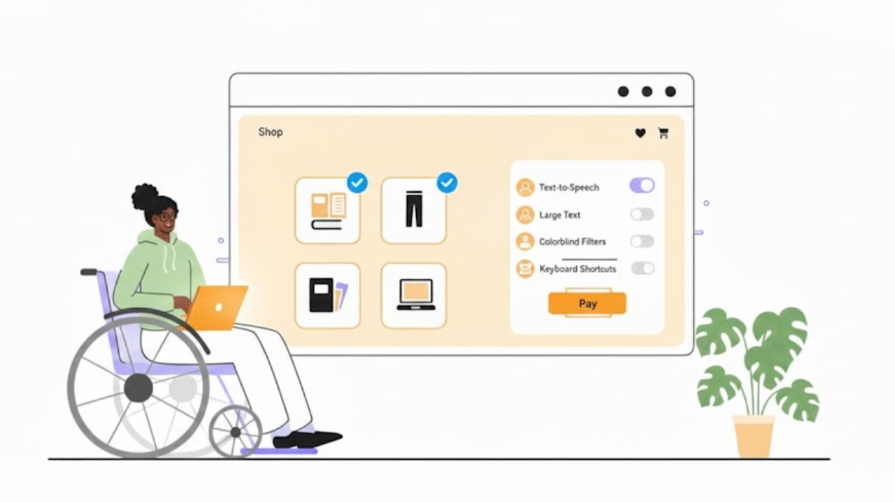
Ecommerce accessibility is about practical shopping tasks.
Can a shopper search, filter, read details, add to cart, and check out without getting stuck?
Accessibility supports many needs, such as vision, hearing, mobility, and cognitive differences. It also supports people with age-related changes who may not think of themselves as “disabled.”
Accessibility Vs Usability Vs UX: The Simple Difference
These words are related, but not the same.
Accessibility means people can use your store at all, even with assistive tools.
Usability means the store is easy to use and not confusing.
User experience is the whole feeling of shopping, like clarity, speed, and trust.
A store can look modern and still be hard to use. Accessibility helps you fix the hidden friction.
Common Barriers Shoppers Face
Here are real blockers that show up in ecommerce:
Text that is too small or low-contrast to read
Menus that only work with a mouse
Filters that trap the keyboard and do not let you escape
Buttons that say “Click Here” with no meaning
Forms that show an error but do not explain how to fix it
Checkout steps that change the page with no clear feedback
When you remove these barriers, shopping feels calmer and more manageable.
How Accessibility Improves Every Step Of The Shopping Journey
Accessibility is not one “site-wide fix.” It improves each step of the shopping journey.
Better Product Discovery And Search
Search and navigation are the start of everything. If shoppers cannot find products, nothing else matters. Accessibility helps discovery through:
Clear headings and page structure (so people can scan)
Keyboard-friendly menus and category links
Search boxes with proper labels (so screen readers can identify them)
Filters that are easy to open, use, and close
This upgrade makes eCommerce navigation feel more intuitive, reflecting real world user experiences instead of confusion.
Better Product Pages That Reduce Confusion
Product pages often fail for simple reasons. People cannot find key information fast. Accessibility supports better product pages by making sure:
Product titles are clear and placed consistently
Price, stock, and shipping details are easy to spot
Images have helpful descriptions when needed (so they are not “blank content”)
Buttons have clear names like “Add To Cart”
Size and colour options can be used by keyboard and screen readers
When product pages are clear, fewer people hesitate.
Better Cart And Checkout Flow
Checkout is where minor problems become significant drop-offs.
Accessibility fixes often improve checkout for everyone.
Key improvements include:
Clear labels for every field
Helpful error messages that explain what went wrong
A logical tab order for keyboard users
A visible focus indicator so users can see where they are on the page
Inline validation can also reduce frustration, because users can fix mistakes before submitting. Baymard notes that inline validation can save users time and effort, yet many sites still do not provide it.
These changes improve completion rates because they reduce confusion.
Key Accessibility Improvements That Directly Boost User Experience
Below are high-impact areas that improve both accessibility and UX.
Straightforward Navigation And Consistent Layout
A store should feel predictable. People should not have to relearn navigation on every page.
Helpful patterns include:
Consistent menus and categories
Breadcrumbs that show where you are
A visible search bar in the same area across pages
“Skip to content” links for keyboard users
This supports ecommerce usability because it reduces mental effort.
Readable Text And Strong Colour Contrast
If people cannot read your content, they cannot buy. Contrast and readability are basic, but often ignored.
Simple readability wins:
Use a comfortable font size
Increase line spacing for long text
Avoid light grey text on white backgrounds
Do not place text over busy images unless you add a transparent overlay
W3C notes that contrast helps many people, including those in limiting situations like bright sunlight.
Keyboard Accessibility For Every Action
Many shoppers cannot use a mouse. Some use only a keyboard. Others use assistive switches or voice tools that rely on keyboard-like navigation.
Your store should allow keyboard access to:
Menus and dropdowns
Search suggestions
Filters and sorting
Quantity controls
Coupon fields
Checkout buttons
Modal popups (with a straightforward way to close them)
A key part is focus visibility. WCAG (Web Content Accessibility Guidelines) includes guidance so users can tell which element has keyboard focus.
Screen Reader-Friendly Content
Screen readers need structure. They do not “see” your layout the way you do.
Helpful structure includes:
One clear H1 per page
Logical H2 and H3 headings
Buttons and links with specific labels
Icons with text labels when the icon alone is not clear
This is the core of user experience accessibility because it allows people to shop confidently with assistive tech.
Accessible Images, Video, And Media
Ecommerce is visual. But visuals need support so more people can understand them.
Practical improvements:
Add valid alt text to product images when the image conveys key information
Keep alt text concise and specific (avoid stuffing keywords)
Add captions for videos, especially product demos
Avoid autoplay video with loud audio
Alt text is invaluable for product understanding, and guidance commonly recommends being specific and concise.
Helpful Forms And Error Handling
Forms are where most ecommerce friction lives. Accessibility improvements often look like “good form design.”
Strong form patterns:
Every field has a label (not only placeholder text)
Errors are described in plain language
The error message tells the user how to fix it
The error is placed near the field, not only at the top of the page
The user can reach the error by keyboard easily
Baymard’s research highlights how form guidance and validation impact checkout performance, and they point out many sites still handle it poorly.
Accessibility Helps Mobile Shoppers And Slow Connections Too
Many people shop on phones. They shop with one hand. They shop while distracted. They shop with weak signals. Accessibility overlaps with mobile UX in many ways:
Larger tap targets reduce mis-taps
Clear spacing improves scanning
Strong contrast improves readability outdoors
Simple layouts load faster and feel calmer
This is part of UX improvement because it makes the store more forgiving in real life.
Accessibility Builds Trust And Reduces Support Requests
When people can complete tasks efficiently, they trust your store more.
Accessibility can reduce support issues like:
“I can’t check out”
“I can’t select a size”
“I can’t apply a discount”
“The page keeps jumping, and I lost my place”
It can also reduce return risk, because clearer product information helps people make better choices.
Quick Checklist: Ecommerce Accessibility Wins You Can Do First
If you want fast improvements, start here:
Fix low-contrast text and buttons
Make sure every interactive item works by keyboard
Ensure focus is visible when tabbing
Add labels to checkout fields and improve error messages
Add alt text where product images are needed
Avoid “click here” links and use descriptive link text
Check that popups can be closed with the keyboard and do not trap focus
These are simple accessibility tips for better ecommerce UX because they remove common blockers without redesigning your entire store.
How To Measure Progress Without Getting Overwhelmed
You do not need to fix everything in one week. You need a clear way to test and improve.
Simple Testing Methods
Try these quick tests:
Keyboard-only test: Can you shop and check out using only Tab, Enter, and arrow keys?
Focus test: Can you always see where you are on the page?
Form test: Can you trigger an error and recover easily?
Screen reader spot-check: Can headings, buttons, and form fields be understood?
Work Toward WCAG Basics
WCAG is a common accessibility guideline used across the web. You do not need to memorise it. Start with basics like keyboard access, readable contrast, and clear labels.
Also note that WCAG updates can add new focus guidance, like keeping focused elements visible and not hidden behind sticky UI.
Common Mistakes To Avoid
Accessibility work can go off-track when it is treated like a shortcut.
Avoid these mistakes:
Fixing only the homepage, but ignoring product pages and checkout
Relying on colour alone to show “sale” or “error”
Using vague link text like “Learn More”
Adding an overlay tool and assuming it solves everything
Ignoring keyboard focus behaviour, especially in menus and popups
The biggest goal is simple. Make shopping actions clear and possible for more people.
Conclusion
Accessibility is not only a compliance topic, but it is also a user experience topic. When you make navigation more straightforward, text easier to read, forms easier to finish, and actions possible by keyboard, you remove friction for real shoppers. That is the heart of ecommerce user experience.
If you want to treat accessibility as part of good design, not a last-minute patch, Inclusive Web is a valuable reference point to keep the work practical and user-focused.
Have Questions?
We Are Inclusive Web
We work with our clients to simplify digital accessibility to ensure your web and digital applications are ADA compliant and accessible to all your users. If you’d like to talk about your digital accessibility, you can email us at matthew@inclusiveweb.co, leave us a note here, or schedule a call here to discuss. Let’s make the web inclusive to all!