Web Accessibility Basics: The Four Foundational Principles
You've probably heard that websites should be accessible. But what does that actually mean? Where do you even start?
The answer is simpler than you think. Web accessibility boils down to four basic ideas. Get these right, and you're well on your way to building websites that work for everyone.
These four principles come from WCAG, which stands for Web Content Accessibility Guidelines. They form the foundation of everything else in web accessibility. Think of them as your starting point for understanding accessibility principles and how they shape the web.
This blog will discuss what each principle means and why it matters.
What Are the Four Principles?
The four principles spell out POUR- Perceivable, Operable, Understandable, and Robust. Every rule in WCAG connects back to one of these four ideas.
POUR gives you a framework for thinking about accessibility. When you run into a problem on your website, ask yourself which principle it affects. This makes fixing issues much easier.
These principles work for all kinds of content. Websites, mobile apps, PDFs, and videos. If people use it online, POUR applies.
Perceivable
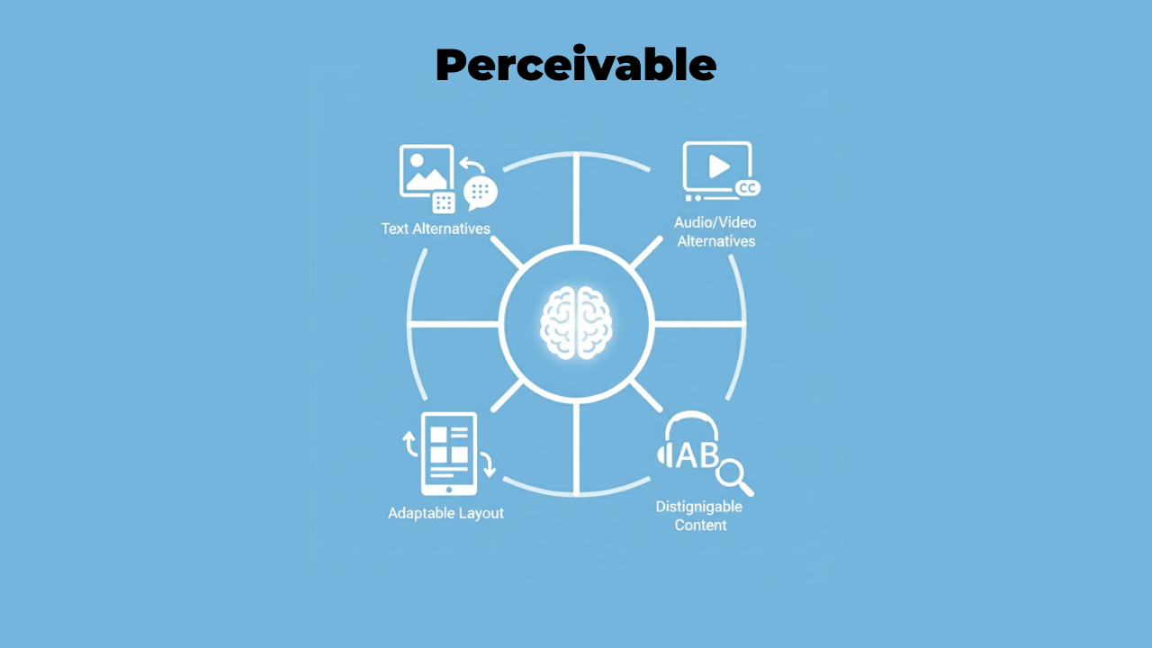
Perceivable means people must be able to see, hear, or feel your content. Information can't be invisible to all their senses.
Think about a blind person using a screen reader. They can't see images. So you need to provide text descriptions that they can hear. That's making content perceivable through a different sense.
Or consider someone watching a video without sound. Maybe they're in a noisy coffee shop. Captions make the audio information perceivable through sight instead of hearing.
Here's what perceivable looks like in practice:
Every image needs alternative text that describes what it shows. A photo of a sunset needs alt text like "orange and pink sunset over ocean waves." Someone using a screen reader hears this description instead of seeing the image.
Videos need captions and transcripts. Captions show spoken words as text. Transcripts provide the full text of everything said in the video.
Color alone can't be your only way to show information. Let's say error messages appear in red text. A colorblind person might miss them. Add an icon or label alongside the color.
Content needs a good contrast between text and background. Light gray text on white is complex to read for anyone with low vision. Black text on white works much better.
Operable
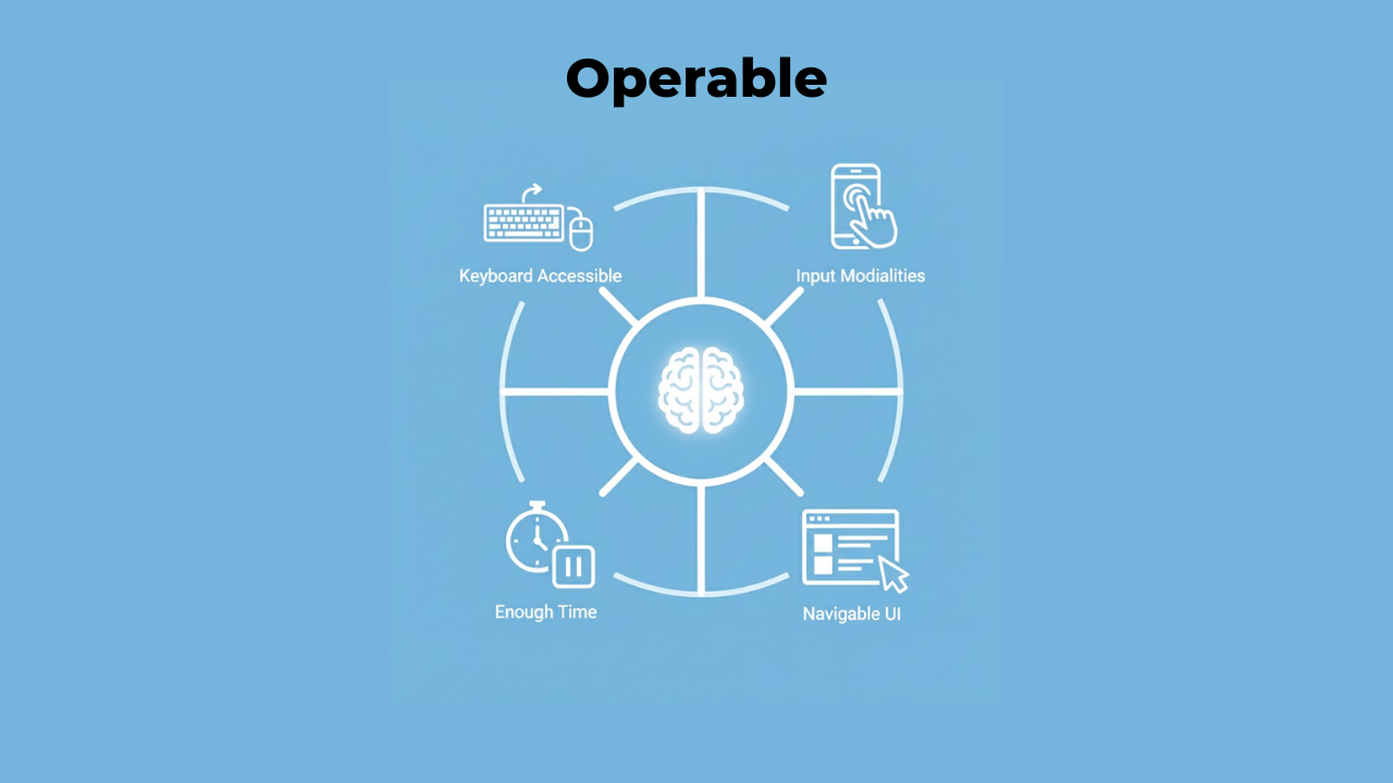
Operable means people must be able to use all your website's features. The interface can't require actions that someone physically can't perform.
Many people can't use a mouse. Some use only a keyboard. Others use voice control or special switches. Your website needs to work with all these methods. Learn essential accessibility features that make websites easier for everyone to navigate. Navigation is a big part of operability. Can someone move through your site using just keyboard keys? Can they skip past repetitive content? Do they have enough time to complete tasks?
Here's what operability looks like:
All functionality must work with a keyboard. Every button, form, menu, and link needs to be reachable using Tab, Enter, and arrow keys. No mouse required.
Moving content shouldn't cause problems. Carousels that auto-advance can trigger seizures in some people. Give users a way to pause or stop movement.
Forms need clear labels and enough time. Don't set a timer that kicks people out while they're filling in information. Some users need extra time to read and respond.
Navigation should be consistent and predictable. Your menu shouldn't change location from page to page. Keep it in the same spot so people know where to find it.
Understandable
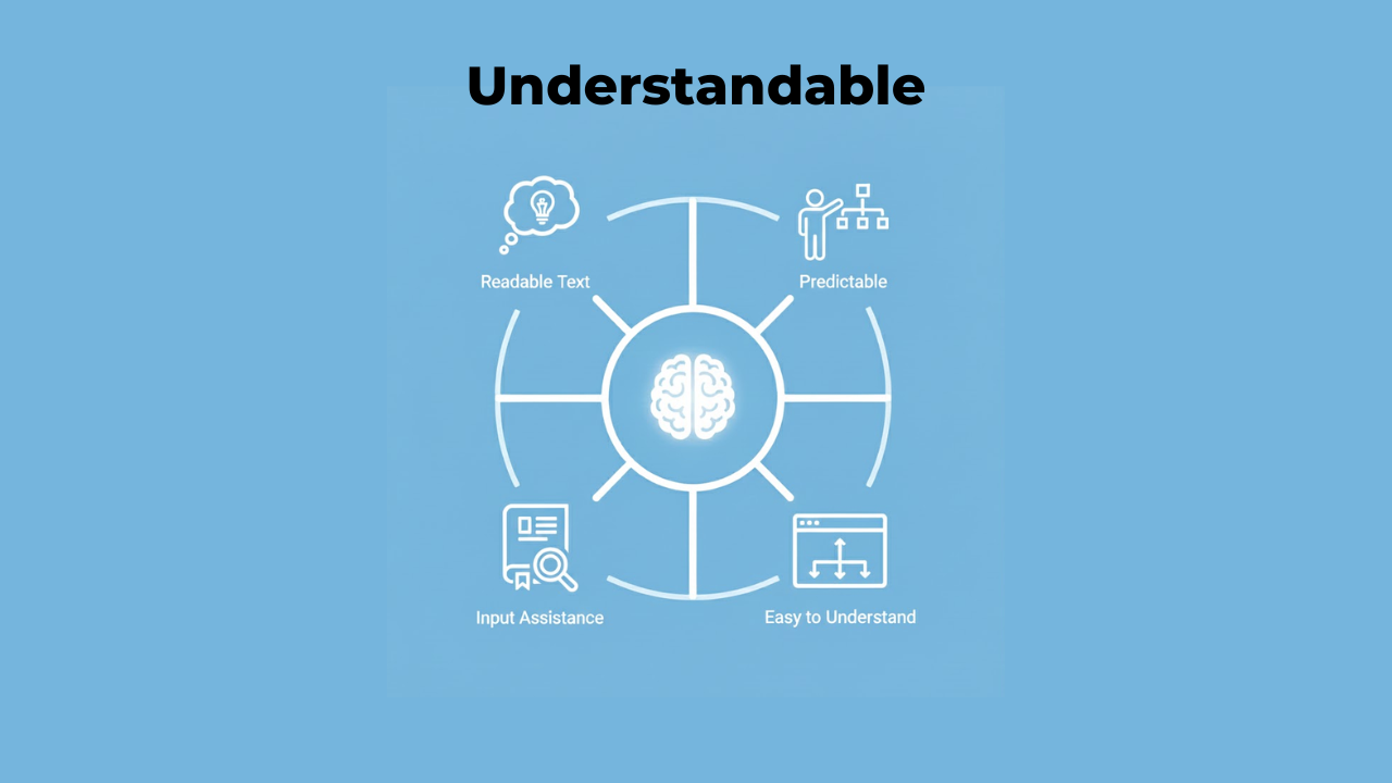
Understandable means people must be able to comprehend your content and how to use your interface. Nothing should be beyond their understanding.
This principle focuses on clarity. Use simple language. Make your site behave in expected ways. Help people fix mistakes.
Understandable doesn't mean dumbing things down. It means communicating clearly with your audience.
Here's what understandable looks like:
Use plain language whenever possible. Technical jargon confuses many readers. If you must use specialized terms, explain them clearly.
Make your site behave predictably. Clicking your logo should take people to the homepage. That's what most websites do, so that's what people expect. Don't surprise users with unexpected behaviors.
Provide clear error messages. "This field is required" beats a vague red border. Tell people exactly what went wrong and how to fix it.
Label form fields clearly. Put labels next to or above input boxes, not inside them as placeholder text. Placeholders disappear when someone types, leaving them confused.
Organize content logically. Use headings that make sense. Break up long pages into digestible sections. Help people understand where they are and where they can go.
Robust
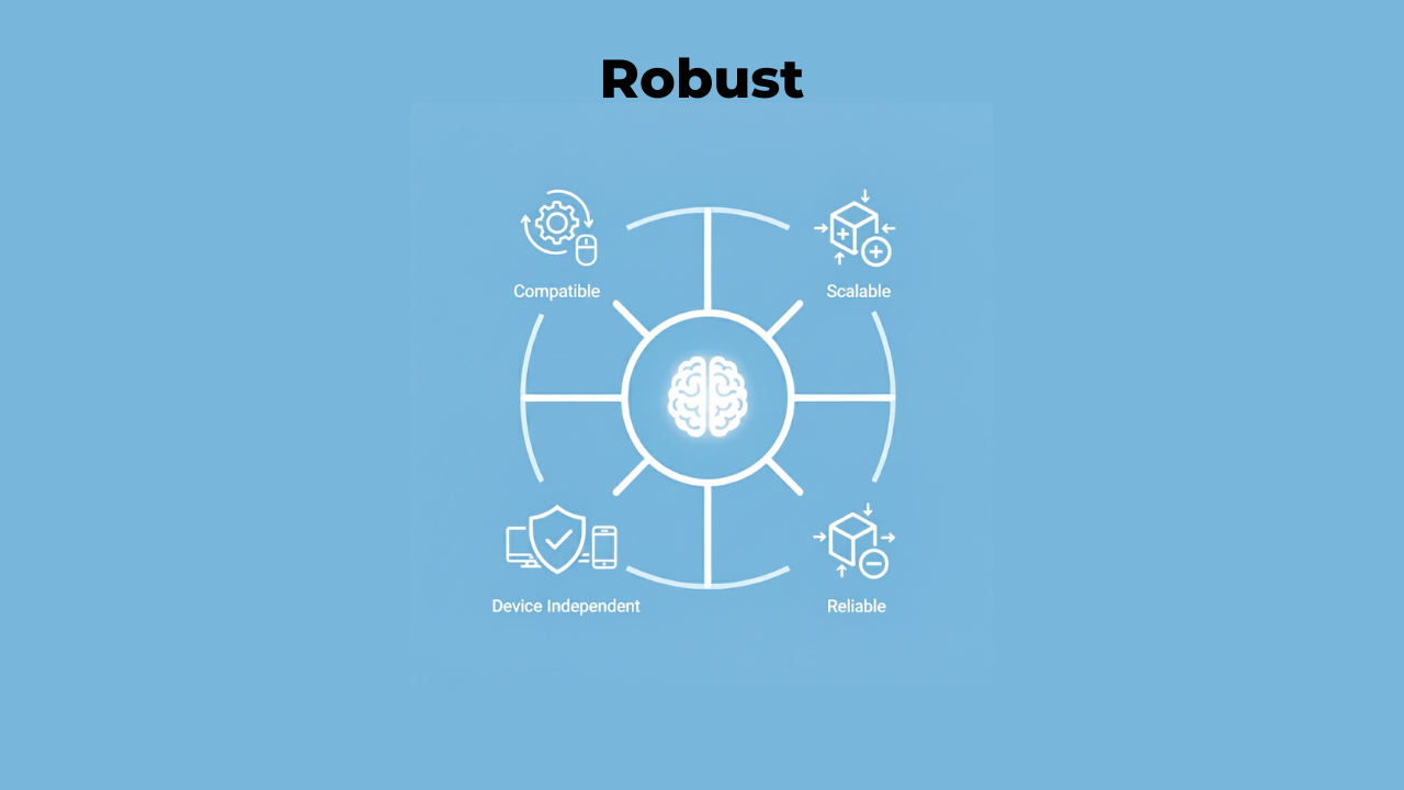
Robust means your content must work reliably across different devices and technologies. As technology changes, your content should still be accessible.
This principle looks toward the future. New browsers appear. Assistive technologies improve. Your website needs to keep working through all these changes.
Robustness comes down to using code correctly and following standards.
Here's what robustness looks like:
Write clean, valid HTML. Use proper opening and closing tags. Screen readers and other assistive tools depend on well-structured code to work correctly.
Use semantic HTML elements. A button should be coded as a button element, not a div that looks like a button. Semantic code tells assistive technologies what each element does.
Test with different browsers and devices. Your site might work great in Chrome but break in Safari. Check it works everywhere people might use it. Check Some Must-Have Tools for Testing Web Accessibility to make accessibility testing faster and easier.
Follow web standards. Standards exist, so websites work consistently across platforms. Stick to them, and your site stays accessible as technology evolves.
How the Principles Work Together
These four principles don't work in isolation. They overlap and support each other.
Take a form as an example. The form needs clear labels so it's understandable. Those labels must be perceivable to screen readers. The form fields must be operable with a keyboard. And the code must be robust enough to work with all assistive technologies.
Fix one principle, and you often improve others. Add good alt text to images, and you've made content both more perceivable and more understandable.
Why These Principles Matter
Understanding the four principles of accessibility gives you a mental model for building accessible websites. Instead of memorizing hundreds of rules, you grasp the underlying concepts.
When you're designing something new, run it through POUR. Can everyone perceive this? Can everyone operate it? Will everyone understand it? Is the code robust enough?
These questions catch problems early, before they're built into your site.
The principles also help explain accessibility to others. Stakeholders who don't know anything about accessibility can understand these four simple ideas. That makes getting buy-in for accessibility work much easier.
Common Mistakes with Each Principle
Every principle has common pitfalls. Knowing them helps you avoid mistakes.
For perceivable, the biggest mistake is missing alt text. Images without descriptions are invisible to screen reader users. Another standard error is poor color contrast that makes text hard to read.
For operable, keyboard traps are a significant problem. This happens when someone can tab into a menu or popup but can't tab back out. They're stuck. Complex hover-only menus also fail operability because keyboard users can't access them.
For understandable, unclear error messages frustrate users. "Error: Invalid input" tells someone helpful nothing. What input? What makes it invalid? How do they fix it?
For robust, invalid HTML causes the most problems. Missing closing tags or improperly nested elements confuse assistive technologies. They can't reliably interpret malformed code.
Testing Against the Four Principles
You don't need expensive tools to check if your site follows POUR. Basic testing catches most issues.
For perceivable, turn off images in your browser. Can you still understand your content? Turn off the sound in a video. Do captions convey everything?
For operable, put away your mouse. Try navigating your entire site using only your keyboard. Can you reach everything? Does the focus indicator show where you are?
For understandable, read your content aloud. Does it make sense? Have someone unfamiliar with your site try using it. Where do they get confused?
For robust, check your HTML with a validator. Run your site through different browsers. Test with a screen reader if possible.
Accessibility Education Starts Here
Learning about POUR gives you the foundation for all accessibility of education. These principles explain why specific rules exist.
Why do images need alt text? Because content must be perceivable. Why must everything work with a keyboard? Because interfaces must be operable. Why should error messages be clear? Because content must be understandable. Why does code need to be valid? Because websites must be robust.
Each technical rule connects back to these four core ideas. Understand the principles, and everything else makes sense.
Applying POUR in Real Work
How do you actually use these principles in your daily work?
During design, ask which senses perceive each piece of information. If something is visual only, add an audio or text equivalent. If it's audio only, add captions or a transcript.
During development, test keyboard navigation early. Don't wait until the end to discover your site only works with a mouse.
When writing content, aim for clarity. If your writing seems confusing, it probably is. Simplify it.
When coding, use semantic HTML from the start. It's much easier than fixing the generic div soup later.
Moving Beyond the Basics
These four principles are your starting point, not your ending point. They're the foundation you build on. Each principle has detailed guidelines beneath it. Those guidelines have specific success criteria you can test against. WCAG organizes everything in this hierarchy.
But you don't need to memorize every guideline right away. Start with POUR. Understand these four ideas deeply. Everything else flows from them.
As you gain experience, you'll naturally learn more specific rules. But you'll always come back to these four principles when you need to understand why something matters.
Conclusion
Four simple words that define web accessibility: perceivable, operable, understandable, and robust. These principles aren't complicated theory. They're practical guidelines you can use today. Can people perceive your content through their available senses? Can they operate your interface? Do they understand what's happening? Will it keep working as technology changes?
Remember that accessibility helps everyone, not just people with disabilities. Captions help people watching videos in quiet places. Good keyboard navigation helps power users who prefer keyboards over mice.
The web works best when it works for everyone. These four principles show you how to make that happen. Companies like Inclusive Web specialize in helping teams implement these principles correctly, but you can start applying them yourself right now. Every website you make more perceivable, operable, understandable, and robust is a website that welcomes more people. That's what good web development looks like.
Have Questions?
We Are Inclusive Web
We work with our clients to simplify digital accessibility to ensure your web and digital applications are ADA compliant and accessible to all your users. If you’d like to talk about your digital accessibility, you can email us at matthew@inclusiveweb.co, leave us a note here, or schedule a call here to discuss. Let’s make the web inclusive to all!