Ecommerce Website Accessibility: What Every Retailer Must Know
Ecommerce accessibility means your online store works for people with different abilities. It means shoppers can browse, read, click, and pay without hitting barriers.
This is not a “nice-to-have” detail. It affects real people and real revenue. A shopper may use a screen reader. Another may not use a mouse. Someone else may need bigger text, clearer buttons, or captions. If your store blocks them, you lose a sale. And they may never come back.
This blog will help you learn what accessibility looks like in a real store, what standards people use, what legal updates are worth knowing, and what to fix first.
What Accessibility Looks Like in a Real Online Store
Let’s picture a normal shopping moment.
A customer lands on your site. They want to buy a jacket. They try to:
Open the menu
Use search
Filter by size
Pick a color
Add to cart
Enter shipping details
Pay and confirm
If any part of that flow is hard to use without a mouse or hard to understand without visual cues, the shopper gets stuck.
Accessibility is about removing those “stuck” moments.
A good store does not require a perfect body, perfect eyesight, perfect hearing, or a perfect device. It works for more people, in more situations, with fewer frustrations.
That is the practical goal of accessibility for ecommerce websites.
The Main Standard to Know (Without Getting Technical)
When people talk about accessibility, they often mention WCAG. WCAG (Web content accessibility guidelines) is a set of guidelines published by the W3C (the organization that helps set web standards). WCAG 2.2 is the current version, published as a W3C Recommendation.
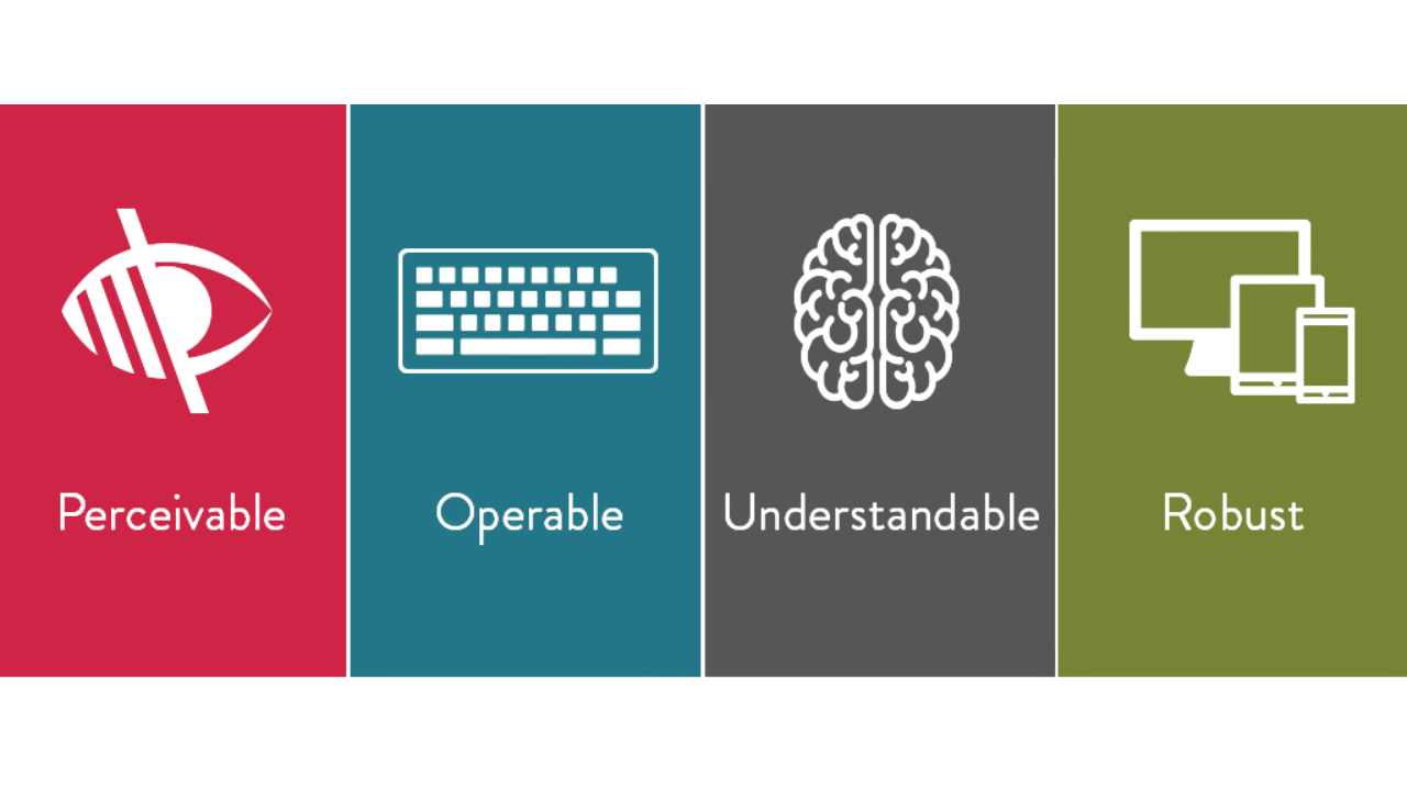
You do not need to memorize every rule. But it helps to know the “big four” ideas. WCAG is built around four principles:
1. Perceivable
People must be able to perceive the content.
Text must be readable.
Images need text alternatives when they carry meaning.
Videos should have captions if they include speech.
2 .Operable
People must be able to use the site.
Everything should work with a keyboard.
Buttons should be reachable.
Popups should be closable.
3. Understandable
People must be able to understand what is happening.
Forms should give clear instructions.
Errors should explain what went wrong.
Language should be simple.
4. Robust
The site should work with assistive tools and modern browsers.
Clean HTML and labels help screen readers interpret pages correctly.
If you keep these four ideas in mind, you will make better decisions across your entire store.
This is also a good way to explain web accessibility for retailers to non-technical teams.
Why Accessibility Helps More Than “Compliance.”
Accessibility is often discussed as if it only matters for legal reasons. But it also helps regular customers.
Here are some everyday examples:
A parent is shopping with one hand while holding a baby
Someone on a cracked phone screen is using large text
A customer with a temporary injury who can’t use a mouse
A shopper in bright sunlight who needs stronger contrast
A person who struggles with long, confusing forms
When a site is easier to use, more shoppers finish checkout.
That is why ecommerce accessibility matters even if you are only thinking about business outcomes.
Legal Basics Retailers Should Understand (High-Level)
Laws and enforcement vary by country and sometimes by state. So this is not legal advice. But there are a few big signals worth knowing.
The U.S. Department of Justice has public guidance on web accessibility and the ADA.
In 2024, the DOJ issued a final rule under ADA Title II for state and local governments, setting specific accessibility requirements for their web content and mobile apps.
Even if your store is not a government site, this is still meaningful because it shows the direction of accessibility expectations in the U.S.
If you work with U.S. federal agencies (or sell into that space), Section 508 is also important. It sets accessibility standards for federal agencies and related digital content.
Ecommerce Accessibility Checklist (The Part You’ll Actually Use)
Below is a practical checklist you can use to improve Ecommerce accessibility for online stores without getting lost.
A) Navigation and menus
Check that:
You can open and close menus with a keyboard
Focus is visible (you can see where you are on the page)
Dropdowns don’t disappear too quickly
Menu items have clear names (not vague labels)
B) Search and filters
Search is the heart of many stores. Make sure:
The search box has a clear label (not just placeholder text)
Filters work with keyboard and screen reader
Selected filters are easy to find and remove
Sort options are readable and don’t reset unexpectedly
C) Product pages
Product pages often create the most significant accessibility issues. Look for:
Clear headings (product name should be the main heading)
Images that include meaningful alt text when needed
Color options that are not “color only” (use text labels too)
Size selection that is clear and not hidden behind icons
Stock messages that are readable and announced clearly
Alt text tip (simple rule):
If an image communicates something important, describe it. If it is purely decorative, it should not distract.
D) Cart and checkout
Checkout is where sales are won or lost. Make sure:
All form fields have labels (not just placeholder hints)
Errors explain what to fix (not just “invalid”)
Error messages are not only red text (use icons and text)
The page does not time out without warning
Payment steps can be completed with the keyboard
Confirmation messages are clear and easy to locate
E) Account pages and order tracking
Common issues include:
Buttons with unclear names like “Click here.”
Only visual status updates
Tables that are hard to read on mobile or with screen readers
F) Popups, modals, and chat widgets
This is a big one.
Can you close the pop-up with the keyboard?
Does focus move into the pop-up and then return correctly?
Can the chat widget be minimized without blocking checkout?
G) Emails and downloadable documents
Many stores forget these:
Order confirmation emails should be readable and well-structured
PDFs should be accessible if they contain key info like returns, warranties, and invoices
Improving these areas supports online store accessibility end-to-end, not just on the main website pages.
The Most Common Accessibility Mistakes in Ecommerce
Here are problems that show up across many online stores:
1. Missing or weak image descriptions
Product images matter. If a screen reader user cannot understand key product details, they may leave.
2. Low contrast text
Light gray text on white looks “clean,” but it can be hard to read. Contrast is not about style. It is about clarity.
3. Keyboard traps
If a user opens a pop-up and can’t exit it, they are stuck. That is a hard fail for usability.
4. Form errors that don’t help
“Something went wrong” is not a helpful message. Good errors say what happened and how to fix it.
Examples of better messages:
“Card number is missing. Please enter the 16-digit number.”
“ZIP code needs five digits.”
5. Focus problems
Focus is the visible indicator that shows where the keyboard is. If focus disappears, the user loses control of the page.
Testing: How to Check Your Store Without Guessing
You do not need a massive program to start improving. You can begin with simple tests. and the must-have tools for testing web accessibility that help you spot issues early.
Step 1: Do a keyboard-only test (5 minutes)
Try your store without a mouse.
Can you reach the main menu?
Can you use search and filters?
Can you add to the cart?
Can you complete checkout?
Can you close pop-ups?
If you can’t, customers can’t.
Step 2: Use an automated scan (quick, but limited)
Automated tools can catch common issues like missing labels or contrast problems. They do not catch everything. But they help you find obvious problems fast.
Step 3: Do basic screen reader spot checks
You don’t have to become an expert. But you can learn enough to spot issues:
Are headings announced in a sensible order?
Do buttons make sense when read aloud?
Do form fields have clear labels?
The best process uses both automation and real testing.
How to Roll Out Fixes Without Breaking Your Store
Accessibility work can feel overwhelming when you try to fix everything at once. It does not have to be that way. The safest approach is to move step by step and focus first on the areas that affect sales.
Start with the paths that customers use to make a purchase:
The journey from the home page to category pages and then to product pages
The flow from product pages to the cart
The checkout process, including the cart, checkout pages, and order confirmation
Once these core paths are stable and accessible, move on to supporting areas such as:
Customer account pages
Help centre and support content.
PDFs, invoices, and email templates
By working in this order, you reduce risk, protect revenue, and make accessibility improvements easier to manage and maintain over time.
A helpful habit is to add accessibility checks into your normal release process:
“Can I use it with a keyboard?”
“Are form labels present?”
“Do error messages tell users what to do?”
“Did we break focus or popups?”
When you do this consistently, accessibility becomes regular maintenance, not a massive project.
Conclusion
Accessibility is not a “one-time task.” It is a quality standard you maintain, like site speed or security.
If you focus on real shopping tasks—browse, filter, choose, pay and make those steps clear for keyboard and screen reader users, you will fix the issues that matter most.
If you want a simple way to structure an ongoing plan, Inclusive Web can be a helpful reference point as you build and maintain your accessibility workflow.
FAQs
1. Do I need to rebuild my ecommerce site to make it accessible?
Usually no. Most fixes are improvements to structure, labels, contrast, and interaction patterns.
2. If I use a popular ecommerce platform, am I automatically accessible?
Not automatically. Themes, plugins, apps, and custom code can introduce barriers. You still need to test your real store.
3. What is the first fix with the most significant impact?
Checkout forms. Clear labels, clear errors, and keyboard support often make the most significant difference quickly.
4. How often should I test accessibility?
At minimum: every time you launch a new theme, new checkout flow, or significant feature. Ideally: small checks during every release.
Have Questions?
We Are Inclusive Web
We work with our clients to simplify digital accessibility to ensure your web and digital applications are ADA compliant and accessible to all your users. If you’d like to talk about your digital accessibility, you can email us at matthew@inclusiveweb.co, leave us a note here, or schedule a call here to discuss. Let’s make the web inclusive to all!


