Top 10 Best Fonts Styles for Dyslexia
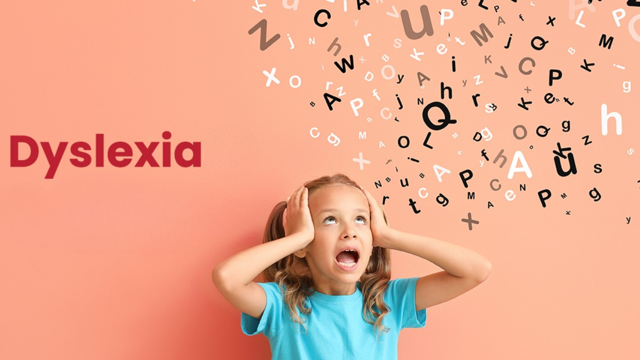
Most of us don’t think twice about fonts. We just open Word or Google Docs and start typing. But for someone with dyslexia, fonts can make a world of difference. The wrong font can make reading feel like a battle. It’s not just frustrating, it’s exhausting.
Dyslexia doesn’t change intelligence; it changes how the brain processes written words. And sometimes, the way text looks can make things a lot harder than it needs to be.
That’s why choosing the best font for dyslexia isn’t about style or design trends — it’s about comfort, clarity, and understanding.
So, let’s talk about it, not like designers or researchers, but like real people who just want reading to feel a little easier.
Why Fonts Matter More Than You Think
Fonts do more than just make text look nice, they can actually change how easy or hard it is to read. For someone with dyslexia, the wrong font can make letters seem jumbled or confusing, while the right one can make reading much smoother. Choosing appropriate fonts is an important part of digital accessibility compliance, helping ensure that digital content is easy to understand for all users.
There isn’t one perfect font that works for everyone, but experts agree that some features make a big difference:
Simple letter shapes: Simple fonts, for example, those with no curls or added details are easy to read.
Clear differences between letters: Letters like b, d, p, and q should look clearly different from one another.
Good spacing: If there is more space between letters and lines, it helps things look clean and not cramped.
Even thickness: Fonts with consistent line weight are easier on the eyes.
Avoid italics and tight alignment: Italics and tight alignments make letters hard to recognize and can break reading flow.
What Is a “Dyslexia-Friendly Font”?
You might’ve heard this term tossed around online – dyslexia-friendly fonts. It simply means fonts designed (or chosen) to reduce confusion and make reading easier for people with dyslexia. These font choices also support WCAG (Web Content Accessibility Guidelines) by helping ensure that digital text is more readable for users with visual or cognitive challenges.
Some fonts were created specifically for dyslexia, like Dyslexie and OpenDyslexic. Others weren’t made for it but happen to work really well because they have clean, open designs, like Arial or Verdana.
They have distinct letter shapes. For instance, in some fonts, “b” and “d” are mirror twins. In dyslexia-friendly fonts, they’re more unique.
They avoid mirroring confusion by slightly changing the slant or weight of letters.
The spacing between words and letters is a bit wider than usual, helping eyes track text smoothly.
They often include heavier bottoms (especially in custom fonts like OpenDyslexic), which help letters “sit” on the line rather than flip or drift.
The Top 10 Fonts You Should Try
1. Arial
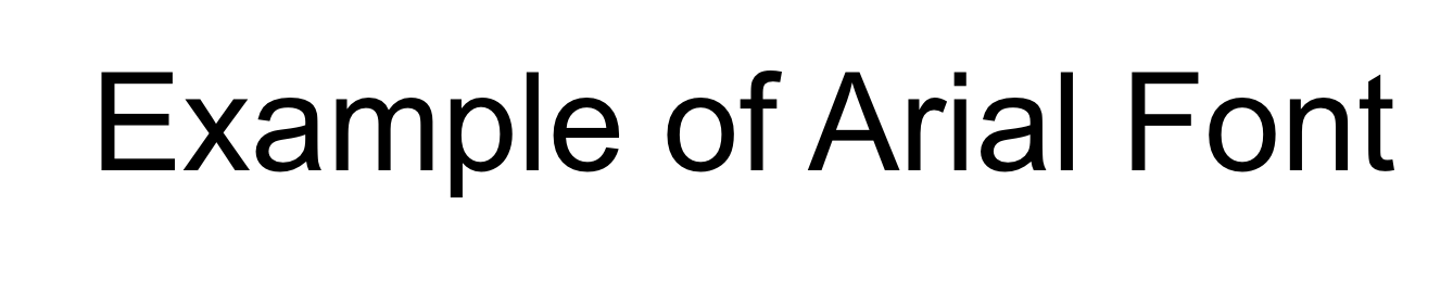
If fonts had a comfort food category, Arial would be it.
It’s clean, balanced, and available everywhere, from your email to your school report.
Why it works:
Even letter spacing
Minimal styling
Familiar shape recognition
Pro tip: Use Arial Regular or Bold, not Narrow. The extra width helps clarity.
2. Verdana
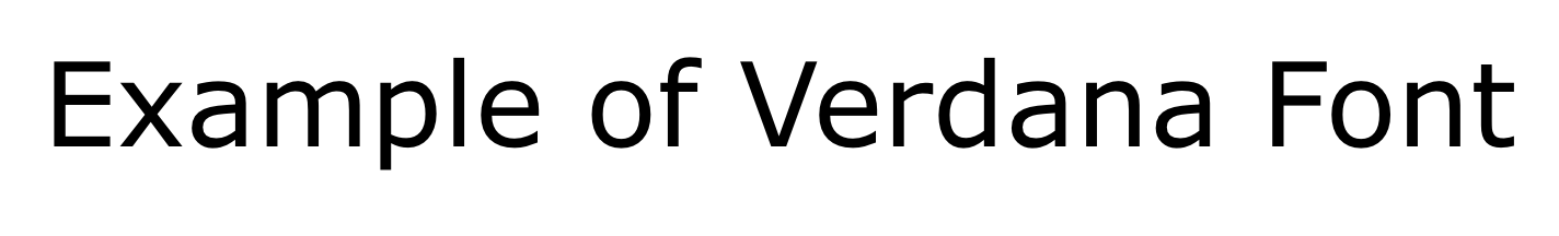
Designed specifically for screens, Verdana has wide letters and extra space built in.
Why it’s great:
Distinct characters (especially lowercase l vs 1)
Comfortable reading on screens and print
Generous spacing, feels “airy” rather than cramped
If you’re building a dyslexia-friendly website, Verdana is a safe bet.
3. Calibri
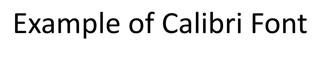
You’ve probably typed in it a hundred times without noticing, that’s the magic.
Why it helps:
Rounded shapes and consistent proportions
Works well for longer reads
Slightly softer than Arial, so it feels friendly on the eyes
If you want a modern, clean look without switching to something exotic, Calibri’s your go-to.
4. Century Gothic
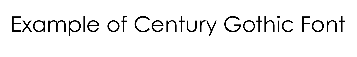
This font looks elegant but still easy to read. Its round letters make text look more open.
Why readers like it:
Big, round letters, easy to tell apart
Good contrast between characters
No unnecessary curls or flourishes
Perfect for print materials or worksheets for younger readers.
5. Comic Sans
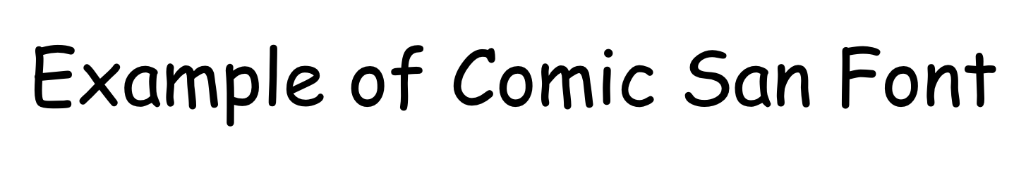
Wait, Comic Sans? The one everyone loves to hate?
Why it surprisingly works:
Each letter is distinct — b, d, p, q don’t look alike.
Informal but extremely readable.
Great for younger readers who need friendly shapes.
Design snobs can look away, but dyslexic readers often find Comic Sans easier than most “professional” fonts.
6. Helvetica
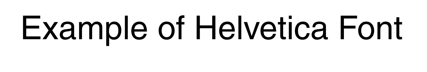
A timeless font, used in signs, brands, and even subway systems.
Why it works:
Crisp and symmetrical
Excellent balance between letter spacing and shape
Minimal distractions, no curls, no uneven strokes
If you like something modern but professional, Helvetica hits that sweet spot.
7. OpenDyslexic
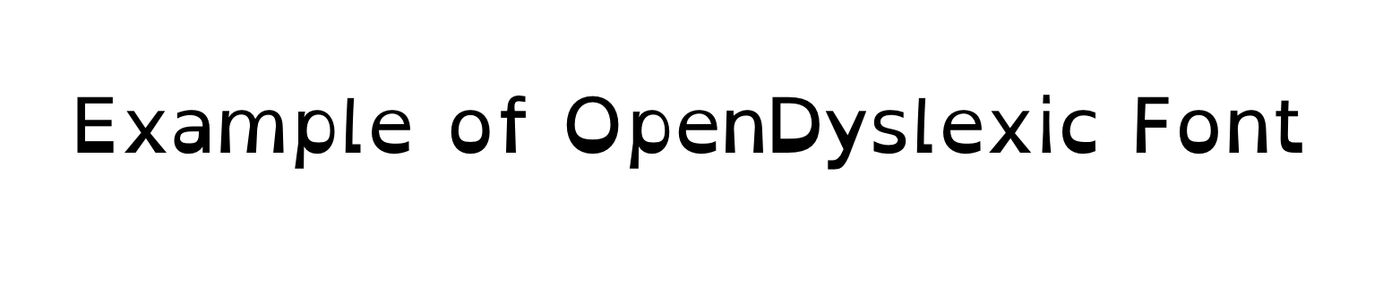
Now we’re moving into fonts created specifically for dyslexia.
What makes it unique:
Heavy bottoms on letters (to prevent flipping or rotation)
Distinctive shapes — so “p”, “b”, and “d” don’t get mixed
Open-source and free to use
Heads-up: Research shows it doesn’t necessarily improve reading speed for everyone, but many people feel more comfortable using it. And that’s what matters.
8. Dyslexie
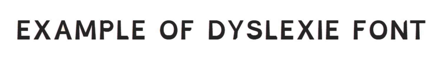
Developed by Dutch designer Christian Boer (who has dyslexia himself), this font takes the idea even further.
Why it’s special:
Letters have unique shapes and slants
Wider spacing between characters and lines
Extra emphasis on bottom weight
It’s not free, but it’s been widely adopted in schools and education tools as a dyslexia-friendly font example.
9. Lexend
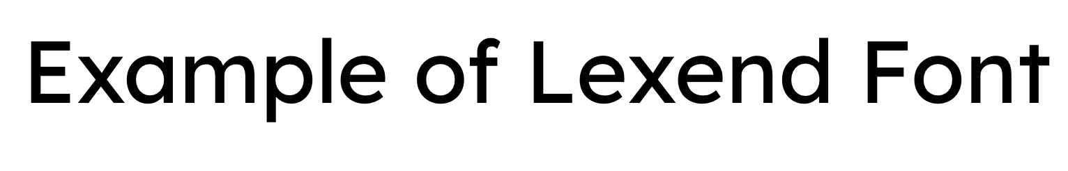
A newer player but one with serious science behind it.
Lexend was designed to reduce visual stress and improve reading fluency.
Why it’s great:
More spacing between letters and words
Simpler, chunkier shapes
Comes in multiple weights for flexibility
It’s modern, readable, and available for free on Google Fonts.
10. Open Sans
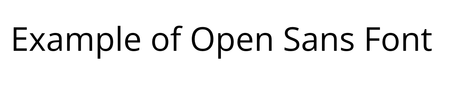
Clean, balanced, and incredibly popular in web design.
Why it’s worth testing:
Excellent readability across devices
Friendly rounded letters
Smooth rhythm that helps the eyes flow from word to word
It’s a solid “default” for digital reading, sleek enough for websites, simple enough for accessibility.
What’s the Easiest Font to Read for Dyslexia?
There’s no one font that will work for everyone. It all depends on the comfort one feels while reading a particular font.
But to be honest, fonts like Arial, Verdana, Lexend, OpenDyslexic, and even Comic Sans tend to be the easiest font to read for dyslexia.
If you are still trying to find out what work best for you, you need to do these things -
Test a few fonts. Don’t stick to one. Try reading some lines written in different fonts and you’ll know which one is the right font for you. This kind of user access testing helps identify what truly feels comfortable.
Play with size and spacing. At times, all you need to do is, increase the size of the text or add more space between lines, and you are good to go.
Keep it consistent. Refrain from mixing various font styles or using bold and italics. Doing this makes reading hard.
Check how it looks on screen. A font that’s easy to read on paper might look cramped or blurry on your phone or laptop.
In the end, the best font is simply the one that feels most natural for you to read without strain.
How to Make Any Font More Dyslexia-Friendly
Even if you can’t change the font (for example, in some school systems or apps), you can still make reading easier.
Here’s how:
Increased text size – 14-16pt is often the sweet spot.
Use extra line spacing – 1.5x spacing keeps lines from blending.
Avoid justified alignment – left-aligned text helps with tracking.
Using clear contrast – dark text on a pale background works best.
Chunk information – shorter paragraphs and bullet points help pacing.
Skip italics and ALL CAPS – they distort familiar shapes.
Choose calm colors – some readers prefer off-white or pastel backgrounds to reduce glare.
You can also explore our blog, “The Ultimate Accessibility User Testing Guide,” for a deeper understanding of effective user testing practices.
The Bottom Line
At the end of the day, fonts aren’t just design choices, they’re about inclusion. For someone with dyslexia, a few small tweaks in typography can make reading feel less like a struggle and more like a smooth conversation with the page.
Remember:
There’s no single “perfect” dyslexia-friendly font.
Clarity and comfort matter more than fancy designs.
Test, adjust, and let the reader decide what feels right.
If you care about making reading easier for all kinds of minds, you’ll love what we do. We turn everyday websites into truly inclusive experiences.
Have Questions?


We Are Inclusive Web
We work with our clients to simplify digital accessibility to ensure your web and digital applications are ADA compliant and accessible to all your users. If you’d like to talk about your digital accessibility, you can email us at matthew@inclusiveweb.co, leave us a note here, or schedule a call here to discuss. Let’s make the web inclusive to all!