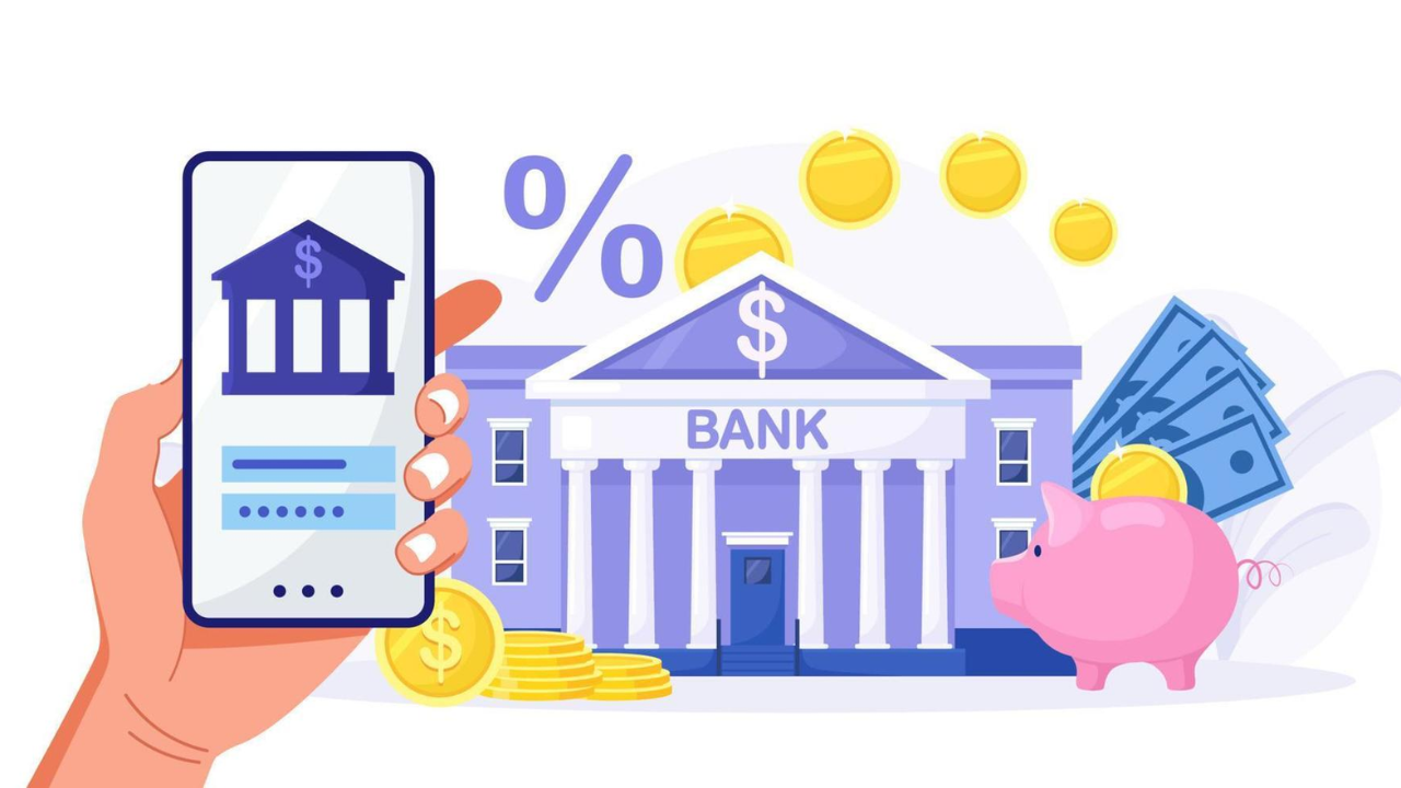
Common Accessibility Mistakes In Mobile Banking User Experience
Mobile banking should feel simple. A person should be able to check a balance, pay a bill, review a transaction, or lock a card without confusion. But many banking apps still create barriers that make basic tasks harder than they need to be. This is why the idea of accessible banking has become more important for financial institutions that want their apps to work well for everyone.
Some of those barriers are obvious. The buttons are too small. Text is too light. Labels are missing. Others are harder to notice. A timeout ends a session too fast. A screen reader reads a chart with no useful meaning. A login step depends too much on memory or drag-and-drop actions. These are not small details.
In banking, small mistakes can block access to funds, cause stress, and erode people's trust in the app. WCAG 2.2 now includes guidance on topics such as target size and accessible authentication, and the W3C has also published guidance on how WCAG 2.2 applies to mobile apps.
That is why mobile banking UX problems deserve serious attention. The goal is not only compliance. The goal is to make important financial tasks work well for real people in real situations.
Why Mobile Banking Accessibility Matters
Banking is not optional. People use banking apps when they are in a rush, under stress, away from home, or making urgent financial decisions. If the app is hard to use, the problem becomes bigger than a normal design flaw. It becomes an access problem.
This is one reason mobile banking accessibility issues need more attention than general website accessibility issues. A retail app with poor usability is frustrating. A banking app with the same flaw can stop someone from paying rent, checking fraud alerts, or confirming a transfer. Inclusive Web’s financial services accessibility guidance also emphasizes that financial services must provide secure, simple digital experiences for everyone.
1. Small Tap Targets
One of the most common mobile banking accessibility issues is small tap areas. Tiny buttons, close-together links, and cramped menu items make the app harder to use for people with limited dexterity, tremors, larger fingers, or anyone using a phone one-handed.
WCAG 2.2 added Target Size (Minimum) at Level AA, which requires pointer targets to be at least 24 by 24 CSS pixels unless an exception applies. Android’s accessibility guidance recommends touch targets of at least 48dp by 48dp.
In banking apps, this mistake often appears in:
small “show password” icons
tiny transfer confirmation links
close-together tabs for accounts
Card controls are placed too near other actions
This is one of the most common accessibility errors because it seems minor during design review, but becomes obvious during real use.
2. Poor Contrast And Hard-To-Read Text
Low contrast is still one of the most common website and app accessibility issues across industries. In banking, it becomes even worse because users often deal with small numbers, transaction dates, and fine details. Problems like this are exactly why wcag guidelines in online banking are important when teams design and review mobile interfaces.
If gray text sits on a pale background, users may miss a payment status or a fee notice. If disabled and active states look almost the same, people may not know what action is available. Android’s accessibility testing guidance flags low contrast as a key issue to catch during review. WCAG 2.2 also continues to require readable contrast levels for text and interface elements.
This problem often shows up in:
transaction history screens
error messages
chart labels
form hints
secondary buttons
These mobile banking UX problems are easy to prevent, but teams often sacrifice readability for a “clean” visual style.
3. Missing Labels For Screen Readers
A banking app may look polished on screen and still fail badly with assistive technology. One major reason is the absence or weakness of labels.
Buttons that only show an icon can become meaningless to a screen reader if they are not labeled properly. A user may hear “button” instead of “transfer,” “download statement,” or “hide balance.” Android’s accessibility guidance calls out content labeling as a core requirement, and its testing tools specifically check whether controls have descriptive labels.
This creates serious accessibility errors in banking apps because so many tasks depend on the exact meaning. In a social app, a vague label is annoying. In a banking app, a vague label can lead to an incorrect action.
Common examples include:
eye icons with no label
Back arrows that do not describe the destination
card controls with only visual symbols
transaction filters announced without context
4. Login And Authentication That Depend Too Much On Memory
Authentication is one of the biggest pain points in banking. It is also one of the most overlooked accessibility issues in mobile banking.
WCAG 2.2 introduced Accessible Authentication (Minimum), which aims to make login easier for people with cognitive disabilities by avoiding tests that rely too heavily on memory, transcription, or puzzle-solving.
This matters in banking apps because many teams keep adding friction in the name of security. Some examples are:
forcing users to copy one-time codes between apps with no autofill support
requiring complex character recall from partial passwords
using image or puzzle challenges without accessible options
blocking password managers
using timed steps that expire too fast
Secure design matters. But security that blocks access is still a failure. Good banking UX must support both safety and usability.
5. Session Timeouts That Create Stress
Banks often use timeouts for security reasons. That makes sense. But timeouts can still be designed badly. Issues like these are often part of hidden accessibility gaps in banking websites that many teams overlook during design and testing.
A timeout that appears with little warning, disappears too fast, or resets a long form can be devastating for users with cognitive disabilities, low vision, or motor limitations. Inclusive Web’s recent banking accessibility resource also calls out timeouts, forms, pop-ups, and mobile layouts as common hidden gaps in digital banking.
This becomes a real problem during tasks like:
loan applications
dispute forms
address changes
fund transfers
account recovery
A secure banking app should protect the session without punishing slower users.
6. Forms That Are Too Hard To Complete
Forms are the heart of mobile banking. Users enter payment details, update their profile information, report fraud, and apply for products. Yet forms remain one of the biggest sources of accessibility errors.
The main problems are familiar:
labels placed only as placeholder text
vague error messages
fields that do not announce format clearly
keyboard focus that jumps unpredictably
The required fields are not explained in a simple way
7. Inconsistent Navigation And Screen Structure
Consistency matters in all digital products, but especially in banking. People return to the same tasks again and again. They expect the same labels, locations, and patterns each time.
When one screen says “Transfer,” another says “Move Money,” and another says “Send Funds,” the language becomes harder to follow. When the back action behaves differently across account areas, users lose confidence. Inclusive Web’s banking resources also stress that clear layouts, simple navigation, and consistent design improve trust and reduce confusion.
This is where banking app accessibility mistakes often overlap with plain UX mistakes. The app may technically function, but it still creates unnecessary mental load.
Conclusion
Many mobile banking accessibility issues come from design choices that seem small at first. But in banking, these details determine whether people can manage their money with confidence.
The most common accessibility errors are not rare technical edge cases. They are everyday product decisions. That is why teams need to look beyond surface design and study real user journeys from login to payment to account help.
When banks reduce website accessibility issues, fix banking app accessibility mistakes, and take mobile banking UX problems seriously, they do more than improve compliance. They make financial access more reliable for everyone. Inclusive Web’s banking resources reflect that same idea: better accessibility leads to clearer, safer, and more usable digital banking experiences.
Have Questions?
We Are Inclusive Web
We work with our clients to simplify digital accessibility to ensure your web and digital applications are ADA compliant and accessible to all your users. If you’d like to talk about your digital accessibility, you can email us at matthew@inclusiveweb.co, leave us a note here, or schedule a call here to discuss. Let’s make the web inclusive to all!