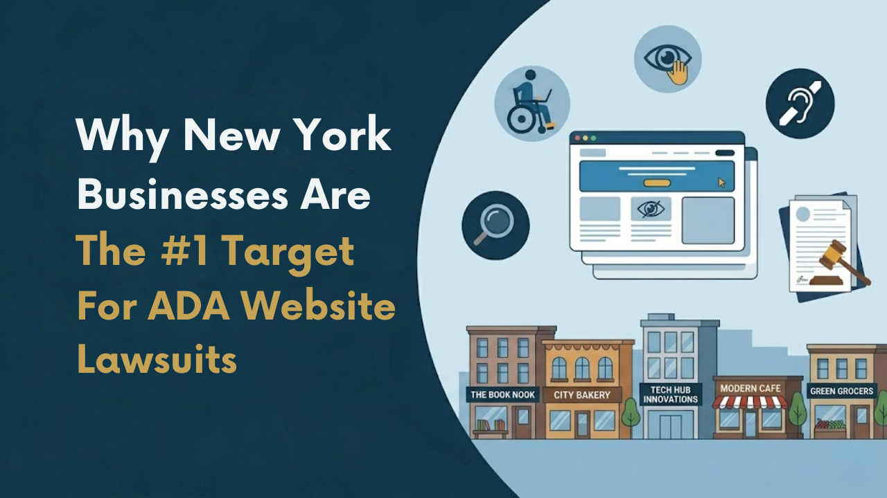
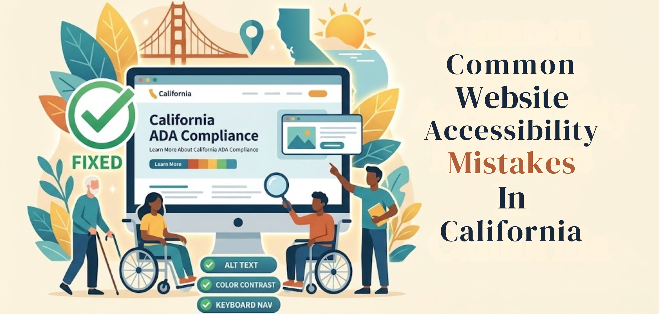
Common Website Accessibility Mistakes In California
A business website should work for everyone. That sounds simple, but many sites still create problems for people with disabilities. A page may look clean and professional yet still be hard to use with a screen reader, keyboard, captions, or a clear page structure. When that happens, users are blocked from information, services, and basic tasks. This is where Digital Accessibility Compliance California becomes important—helping businesses identify gaps early and take the right steps to fix them before they turn into bigger issues
This matters even more in California. The U.S. Department of Justice says businesses open to the public must make the goods and services they offer online accessible to people with disabilities. California also has strong civil rights laws, including the Unruh Civil Rights Act, which can increase legal pressure when access barriers are ignored.
Many owners do not set out to exclude anyone. Most problems come from rushed design, weak content habits, and updates made without testing. A new plugin gets added—a form change. A PDF gets uploaded. A video goes live without captions. Small choices add up. Over time, these become common accessibility issues that make a site harder to use.

Why These Mistakes Keep Happening
Many teams think accessibility is technical and separate from regular web work. It is not. Accessibility is part of writing, design, layout, code, navigation, and content updates. If a team treats it like an extra step, it often gets ignored until someone complains.
Another reason is that many businesses rely too much on visual review. If a page looks fine on a laptop screen, they assume it is fine for everyone. That is where many web accessibility issues begin. Most of these issues go unnoticed until they impact users—run a web audit to check your web accessibility before it becomes a problem.
Missing Alt Text On Images
One of the most common accessibility issues is missing alt text. Alt text provides a short description of an image so screen reader users can understand what it depicts. If the image has meaning and the alt text is missing, that meaning is lost.
This happens on service, product, team, and blog pages. Businesses upload photos, icons, banners, and graphics, but leave the alt field blank. Sometimes they add text that says almost nothing, such as “image” or a file name. Good alt text should explain the image's purpose in plain language. W3C treats text alternatives as a basic part of accessible content.
Low Contrast That Makes Text Hard To Read
Text should be easy to see. Yet many websites use pale gray text, weak button colors, or light text over bright images. It may look stylish, but it is harder to read for many users.
This is one of the web accessibility issues that often gets missed because designers focus on appearance first. But if people have to strain to read, the design is not doing its job. Good contrast helps people with low vision, older users, and anyone reading on a phone in bright light.
Menus And Buttons That Do Not Work By Keyboard
Not every user navigates with a mouse. Many people use only a keyboard. They navigate links, menus, forms, and buttons by tabbing through the page. If the website does not support that, the user can get stuck very quickly.
This is one of the most serious website compliance issues California businesses face. A visitor may reach the homepage but fail to open the menu, close a pop-up, or submit a form. To understand how these issues impact compliance in 2026, read our digital accessibility compliance california: full guide 2026.
Some sites also hide the keyboard focus marker, so users cannot tell where they are on the page. W3C guidance is clear that users must be able to operate web content through a keyboard interface.
Forms With Poor Labels And Confusing Errors
Forms are where many accessibility compliance errors California businesses make become obvious. A contact form, booking form, checkout page, or quote request may look simple, but it can fail badly if the fields are not labeled correctly.
A user needs to know what each field is asking for. A screen reader needs to read those labels clearly. If the form shows errors, they should be easy to find and understand. Users should not have to guess what went wrong or be told only by color. A clear form helps everyone.
Videos Without Captions
Video is now common on business websites. It is used for explainers, product demos, service overviews, customer stories, and social content. But many businesses still post videos without captions.
That creates a direct barrier for deaf and hard-of-hearing users. It also affects people who watch videos with sound off, which is common on phones. Captions are not a nice extra. They are part of clear access. The W3C includes captions and other media alternatives in its accessibility guidance because information should not depend solely on sound.
PDFs And Downloadable Files That No One Tests
A website is not only made of web pages. Many businesses also upload brochures, forms, menus, price sheets, handbooks, and reports as PDFs. That is where another major problem begins.
A PDF can look normal on screen and still be unusable with assistive technology. If the text is just an image or the file lacks a reading order, headings, or tags, the user may not be able to access the information in a useful way. This is one of the common accessibility issues that gets missed because teams focus only on the page, not the documents attached to it. To understand what features your website should include, check essential accessibility features every website should have.
Poor Heading Structure
Headings help users understand a page fast. They also help screen reader users move through content in a logical order. When headings are skipped, used out of order, or added only to make text look bigger, the page becomes harder to follow.
This is a simple issue, but it matters. A clear heading structure gives the page shape. It helps people scan, understand, and return to the part they need.
Weak Link Text
Links should tell users where they are going. Phrases like “click here,” “learn more,” or “read this” are often too vague on their own. They force users to guess the destination.
That becomes a bigger problem for screen reader users who may review links out of context. Good link text should make sense on its own. It should tell the user what comes next.
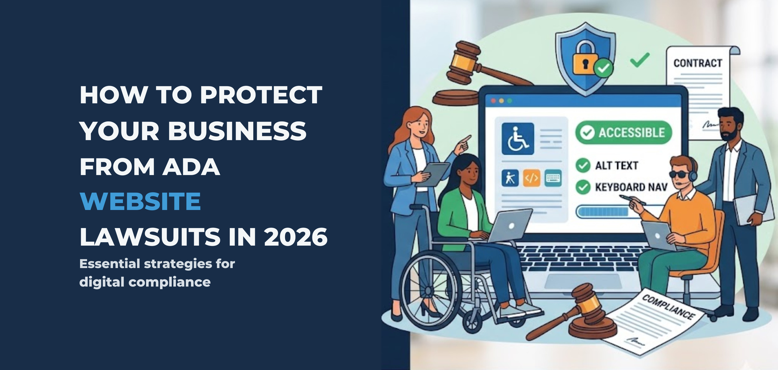
What Small Businesses Should Do Next
The best response is not panic. It is a clear review process. Start with the pages that matter most. Check the home page, menu, contact page, forms, booking flow, checkout flow, and key service pages. Review videos, PDFs, and buttons. Test keyboard use. Check color contrast. Add useful alt text. Clean up heading order.
Most of all, stop treating accessibility like a one-time fix. Websites change all the time. New content gets added every week. That means accessibility needs regular attention too. W3C recommends checking accessibility early and throughout design and development, not only after launch.
Make Your Website Easier To Use
The biggest accessibility mistakes are usually not complex. They are basic problems that persist too long. They affect real people trying to read, click, book, buy, or ask for help. Fixing them improves usability, reduces risk, and makes the website work better for everyone. Inclusive Web can help review problem areas and guide improvements.
Have Questions?
We Are Inclusive Web
We work with our clients to simplify digital accessibility to ensure your web and digital applications are ADA compliant and accessible to all your users. If you’d like to talk about your digital accessibility, you can email us at matthew@inclusiveweb.co, leave us a note here, or schedule a call here to discuss. Let’s make the web inclusive to all!