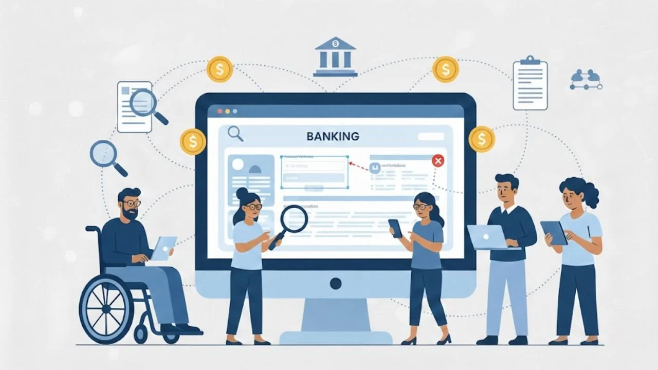
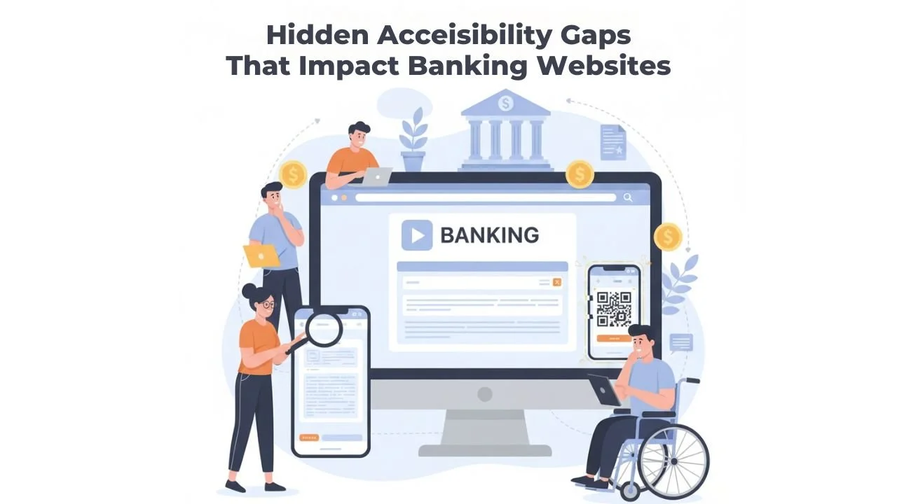
Hidden Accessibility Gaps That Impact Banking Websites
Online banking is now the main way people manage money. Many people no longer visit branches. They check balances on a phone. They pay bills from a laptop. They send money to their families in minutes. This convenience is helpful. But it also brings a new problem. If a banking website is hard to use, some customers get blocked from basic financial tasks.
Many banks think their websites are accessible. They may run a quick scan. They may fix a few visible issues. They may add an accessibility tool. Then they assume the problem is solved. But real accessibility is not always obvious. A website can look fine and still be difficult for many users. The biggest issues are often hidden inside forms, pop-ups, menus, and mobile screens. These are Hidden accessibility gaps in banking websites. They can quietly create real harm.
This article explains the hidden gaps that many teams miss. It also explains why they matter and how to find them. The goal is simple. A accessible banking website should work for every customer, without stress and without confusion.
Why Hidden Gaps Matter in Banking
Banking is not like shopping or entertainment. People can leave a shopping website and come back later. Banking is different. A person may need to pay rent today. They may need to transfer money for a medical bill. They may need to confirm a payment to avoid a late fee. When a banking website blocks them, it becomes a serious problem.
These barriers can turn into real financial barriers. They can also increase anxiety and stress. A user may feel scared to press the wrong button. They may worry that money will disappear. They may give up and call support.
In many cases, calling support is not simple. Some users do not have time. Some have language limitations. Some feel embarrassed. This is one of the hidden challenges of banking in the digital world.
The hard truth is simple. If a customer cannot use online banking independently, the service is not fully working.
What “Hidden Accessibility Gaps” Really Means
A hidden accessibility gap is a problem that does not show up in basic checks. It is often missed by quick testing. It may not appear on the homepage. It may only appear during real tasks, like adding a new payee or changing a password.
These gaps often affect people who use:
Screen readers
Keyboard navigation
Voice control tools
Screen magnifiers
Captions or transcripts
Simple layouts and clear steps
Many teams focus only on surface-level compliance. They may pass an automated tool even, when using must-have tools for testing web accessibility. But real users still struggle. That is why these issues are called Hidden barriers affecting online banking users. They are real problems, even when they are not visible to everyone.
1: Keyboard Focus That Is Missing or Hard to See
Some users cannot use a mouse. They use a keyboard to move through a website. They press Tab to move forward. They press Enter to select. This is normal for many people with mobility limitations.
The problem starts when the website fails to indicate where the keyboard focus is. If the focus outline is removed or too faint, the user cannot tell what they are selecting. That creates confusion and fear. In banking, fear is a major issue. People do not want to click the wrong thing when money is involved.
This gap appears in places like:
Login screens
Payment screens
Card lock and unlock options
Confirmation screens
This is one of the most common Accessibility gaps in online banking because it is easy for teams to overlook during visual design.
2: Forms That “Look Fine” But Fail Users
Banking forms are everywhere—login, transfers, loan requests, address changes, dispute forms, and card replacement requests. A form may look clean and modern, but still be hard to use.
Common hidden form issues include:
Labels that disappear when you start typing
Instructions that show only after an error
Required fields that are not clearly marked
Errors that appear at the top, far from the field
A form that clears everything after one mistake
These issues create stress. They also waste time. A user may try three times and still fail. They may abandon the task. This is a real example of how accessibility gaps impact online banking users in daily life.
Forms should guide people gently. They should not punish mistakes. They should not force users to guess.
3: Session Timeouts That Log Users Out Without Clear Support
Banking websites often use session time limits for security. This is necessary. But the way timeouts are handled can create serious accessibility problems.
Many users do not receive a clear warning before the session ends. Some warnings appear in small text. Some pop-ups are not easy to use with a keyboard. Some alerts are not read properly by screen readers, which highlights the kind of online banking accessibility tips teams often overlook.
Common issues include:
The session ends without a clear and visible warning.
The warning message is not announced to screen readers.
The “Extend Session” button cannot be reached with a keyboard.
The user loses all progress after logging out.
There is no clear explanation of what happened.
This is especially harmful during long tasks. A user may be filling out a loan form or setting up a new payee. If the session ends suddenly, they must start over. This creates stress and confusion. It also increases Hidden barriers affecting online banking users who need more time to complete tasks.
4: Pop-Ups and Modals That Trap Users
Banking websites often use pop-ups. These include fraud alerts, marketing messages, cookie banners, and security prompts. Some of these are important. But they often create hidden accessibility problems.
Common issues include:
The pop-up steals focus, and the user cannot return to the page.
The close button is hard to reach with the keyboard.
The pop-up does not announce itself to screen readers.
The background cannot be accessed even after closing.
The pop-up covers important buttons.
This is especially harmful on mobile. A pop-up may cover the “Pay Now” button. The user may not know how to dismiss it. This creates real Hidden barriers affecting online banking users.
5: Mobile Issues That Appear Only When Users Zoom
Many teams test mobile layouts without zooming. But many users enlarge text, which is why applying proper mobile accessibility techniques is essential. This is common for people with low vision and for older adults.
Hidden mobile issues include:
Text overlaps or gets cut off.
Buttons move off-screen
Menus become hard to close.
Important actions become too small to tap
Pages jump when the text size changes.
These issues often appear only when users increase text size. That is why teams miss them. Still, they are part of the Impact of hidden accessibility gaps on user experience.
6: Captchas That Block Real People
CAPTCHA is used to stop bots. But many CAPTCHA also block real users. Visual puzzles can be hard for people with low vision. Audio captchas can be unclear for people with hearing challenges or processing issues.
If a user cannot solve the captcha, they may be locked out of their account. That is not a small inconvenience. It becomes a serious barrier.
Banks should use methods that do not create unnecessary blocks for real customers.
Conclusion
Hidden accessibility gaps do not always appear during quick testing. They appear during real tasks. They show up when a session times out without a proper warning. They show up when a third-party tool traps a keyboard user. They appear when users lose progress and must start over.
These issues may seem small, but they have serious consequences. They increase frustration. They reduce confidence. They can even prevent users from accessing their own money.
Fixing these gaps requires careful testing of real user journeys. Banks must review timeouts, pop-ups, forms, mobile layouts, and third-party tools. Accessibility should be built into daily processes, not added at the end.
We at Inclusive Web, help teams uncover these hidden barriers and create stronger, more reliable online banking experiences. The goal is simple. Banking websites should work smoothly for every user, without hidden obstacles and without unnecessary stress.
Have Questions?
We Are Inclusive Web
We work with our clients to simplify digital accessibility to ensure your web and digital applications are ADA compliant and accessible to all your users. If you’d like to talk about your digital accessibility, you can email us at matthew@inclusiveweb.co, leave us a note here, or schedule a call here to discuss. Let’s make the web inclusive to all!