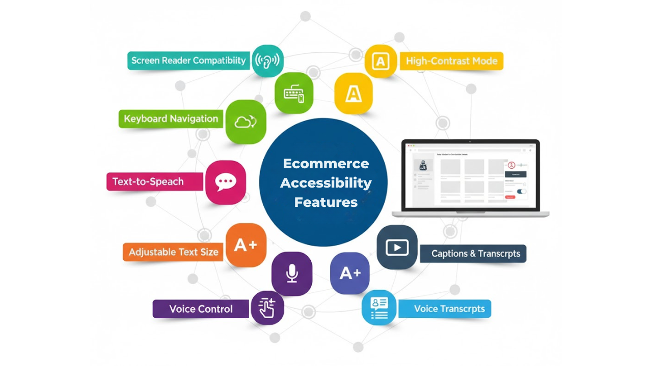
Top 7 Web Accessibility Ecommerce Features You Must Add
Most online stores are built to look good. But shopping is not only about looks. It is about getting the job done. A shopper should be able to browse, compare, and check out without getting stuck.
That is what accessibility helps you achieve. Ecommerce accessibility is often explained as “support for people with disabilities.”
That is true. But it is also a practical upgrade for everyone.
It helps shoppers who use keyboards.
It helps people on small screens.
It helps older users.
It helps people in bright light.
It helps anyone tired, rushed, or distracted.
In this blog, you will learn seven accessibility features for websites that make an online store easier to use.
They also help reduce common drop-offs during browsing and checkout.
Why Ecommerce Accessibility Features Matter For Every Online Store
Online shopping includes many small steps, like search, filters, product pages, the cart, checkout, and payment. A small barrier at any step can stop the purchase.
That barrier might be invisible if you always shop with a mouse and perfect vision.
Accessibility removes those barriers.
These ecommerce site accessibility features also improves overall usability, because good accessibility is often just good design:
Clear labels
Clear actions
Clear feedback
Predictable navigation
Now let’s get into the seven ecommerce website features.
1. Keyboard-Friendly Navigation And Visible Focus
Some shoppers do not use a mouse.
They use a keyboard. Or they use tools that act like a keyboard.
Your store should be fully usable with:
Tab
Shift + Tab
Enter
Space
Arrow keys
Escape
What This Feature Looks Like In A Real Store
A shopper can:
Tab into the menu and open it
Move through category links
Use search and suggestions
Change filters and sorting
Add a product to the cart
Move through checkout fields
Submit payment
They can also always see where they are.
That “where am I?” indicator is called focus.
The focus outline should be visible and apparent.
Why It Improves Usability
Keyboard users often abandon stores because they get trapped.
They cannot close a popup.
They cannot reach the checkout button.
They lose their place.
When focus is visible and the keyboard flow is smooth, shopping feels safe and controlled.
Quick Implementation Notes
Add a “skip to content” link at the top of the page.
Make sure dropdown menus can open and close by keyboard.
Avoid “keyboard traps” inside popups and filter panels.
Never remove focus outlines without replacing them with a clear alternative.
2. Clear Headings, Landmarks, And Page Structure
A clean page structure helps people scan faster.
It also helps screen readers announce content in a logical order.
What This Feature Looks Like
Each page has:
One clear main title at the top
Section headings that follow a logical order
A layout that stays consistent across templates
For example:
Category page headings are consistent.
Product page sections always appear in the same order.
Checkout steps are labeled clearly.
Why It Improves Shopping Speed
Many shoppers do not read every word.
They scan.
Clear structure helps them jump to what they need:
Price
Sizes
Shipping info
Reviews
Return policy
Screen reader users also rely on headings to move quickly.
If headings are used only for styling, that experience breaks.
Quick Implementation Notes
Use headings to organize content, not to make text bigger.
Keep templates consistent across the site.
Make sure key sections like “Delivery” and “Returns” are manageable to find.
3. High Color Contrast And Readable Text Settings
If people cannot read your text, they cannot buy.
This issue is more common than many teams think.
Low contrast can hide:
Prices
Sale labels
Button text
Error messages
Input hints
What This Feature Looks Like
Text is readable without squinting.
Buttons are clear.
Links look like links.
Focus states are visible.
Essential warnings are not shown by color alone.
Why It Reduces Abandonment
Poor readability creates fatigue.
People leave when a site feels hard.
Good contrast helps:
People with low vision
People with color vision differences
Mobile users outdoors
Older users who need stronger clarity
Quick Implementation Notes
Avoid light grey text on white backgrounds.
Avoid thin fonts for important information.
Ensure buttons and links stand out clearly.
Do not place important text over busy images unless you add a strong overlay.
4. Accessible Product Images With Useful Alt Text
Product images are a big part of ecommerce.
But images do not help everyone in the same way.
Alt text is a short description attached to an image.
Screen readers can read it out loud.
What This Feature Looks Like
Main product images have short, valid alt text.
Decorative images use empty alt text, so they are skipped.
Key product details that appear only in images are also available in text.
Why It Improves Product Understanding
Some shoppers cannot see images clearly.
Others have images blocked due to connection issues.
Some use screen readers.
Alt text helps them understand what they are buying.
It also helps when a product has a key detail that matters:
“Black leather wallet with silver zipper”
“Pack of three cotton crew socks”
“Sneakers with a wide toe box”
Quick Implementation Notes
Keep alt text short and specific.
Describe what matters for shopping decisions.
Do not repeat the exact alt text for every image.
Do not stuff keywords into alt text.
5. Accessible Filters, Sorting, And Search Suggestions
Filters and sorting often break accessibility.
They also break usability for many people, even without disabilities.
What This Feature Looks Like
Shoppers can:
Open filters by keyboard
Move through filter options easily
Apply filters without losing their place
Clear filters without hunting for a tiny button
Use sorting without confusion
Use search suggestions without the page jumping
Why It Improves Product Discovery
Filters are not optional in most stores.
They are the path to the right product.
If filters are complex to use, people give up.
They may also buy the wrong item and return it later.
Quick Implementation Notes
Use clear labels for filter groups, like “Size” and “Color.”
Make sure checkboxes and toggles are easy to reach and use.
Show clear feedback when filters apply, like “18 results.”
Avoid filter panels that trap focus or cannot be closed by keyboard.
6. Accessible Forms And Error Messages In Checkout
Checkout is where accessibility becomes business-critical.
If people cannot complete forms, the sale is lost.
What This Feature Looks Like
Checkout forms have:
Labels on every field
Clear required-field indicators
Error messages that explain the fix
Errors are placed near the field
Focus moved to the first error when needed
It also includes clear button labels:
“Continue To Shipping”
“Continue To Payment”
“Place Order”
Why It Improves Checkout Completion
Most checkout failures happen because shoppers feel confused.
They do not know what went wrong and cannot find the field that needs fixing.
Clear form feedback reduces that stress.
Good error messages are simple:
“Enter a valid email address.”
“Card number is missing.”
“Postal code is too short.”
Quick Implementation Notes
Do not rely only on red color for errors.
Use plain language and one explicit instruction.
Make sure coupon fields are accessible too.
Ensure keyboard order follows the visual order.
7. Accessible Modals, Popups, And Notifications
Popups are everywhere in ecommerce- email capture, cookie notices, size charts, quick views, and added-to-cart confirmations and if they aren’t accessible, users can get stuck.
What This Feature Looks Like
When a modal opens:
Focus moves into the modal
The background does not trap the keyboard
Escape closes the modal
The close button is easy to find and labeled clearly
Focus returns to the original element when the modal closes
Notifications also work well:
“Added to cart” is shown clearly
It does not disappear too fast
Screen reader users can understand it
Why It Prevents Drop-Off
Inaccessible popups are a common “rage quit” moment.
A shopper cannot close it, so they leave.
Accessible modals keep the shopping flow smooth.
Quick Implementation Notes
Avoid auto-opening popups immediately on page load.
Keep modal content simple and focused.
Use clear action buttons like “Close” or “Continue Shopping.”
Make sure cookie banners are keyboard-friendly too.
Quick “Add These First” Priority Checklist
If you can only fix three areas first, start here:
Keyboard Navigation And Visible Focus
Checkout Forms And Error Messages
Filters, Sorting, And Search
These three areas reduce the most common “stuck moments.”
They also improve the experience for the broadest range of shoppers.
How To Test These 7 Features Fast
You can check some tools for testing web accessibility to catch the most significant issues.
Start with simple tests.
Keyboard-Only Test
Try this in your store:
Open the homepage
Use Tab to reach the menu
Navigate to a category page
Use filters and sorting
Open a product page
Add to cart
Go to checkout
Complete the form steps
If you get stuck, your users will get stuck too.
Screen Reader Spot Test
You do not need to be an expert.
Just spot-check basics:
Do headings sound logical?
Do buttons make sense when read out loud?
Do form fields have clear labels?
Do error messages explain what to fix?
Contrast And Zoom Test
Zoom the page to 200%.
Check if text overlaps or disappears.
Check if buttons remain usable.
Check if checkout is still easy.
Common Mistakes To Avoid
Accessibility work can fail when it is treated like a quick patch.
Avoid these common mistakes:
Using an overlay tool and assuming it fixes everything
Fixing only the homepage and ignoring checkout
Using vague link text like “Click Here.”
Removing focus outlines because they “look ugly.”
Building filters that work only on hover
Showing errors only by color, without text
Creating popups that trap keyboard users
The goal is simple. Make shopping actions clear and possible.
Conclusion
Accessibility is a direct upgrade to how your store feels and works.
When you add features of an ecommerce website such as keyboard support, clear structure, strong readability, accessible media, smooth filters, usable checkout forms, and safe popups, you reduce frustration across the whole journey.
You also support more shoppers, in more situations, with less effort. If you want to keep building an online store experience that feels simple, calm, and usable for more people, Inclusive Web is a solid reference point to guide your following accessibility improvements.
Have Questions?

We Are Inclusive Web
We work with our clients to simplify digital accessibility to ensure your web and digital applications are ADA compliant and accessible to all your users. If you’d like to talk about your digital accessibility, you can email us at matthew@inclusiveweb.co, leave us a note here, or schedule a call here to discuss. Let’s make the web inclusive to all!