Writing Accessible Content: UX Microcopy That Works for All
You want your words to actually help people, not slow them down or shut them out. Accessible UX microcopy does precisely that by guiding every user, including people with disabilities, through each step with clarity and respect.
When your content is easy to read, easy to follow, and friendly to assistive technology, you build trust. It helps more people complete what they came to do.
1. Plain language: Your Primary Tool
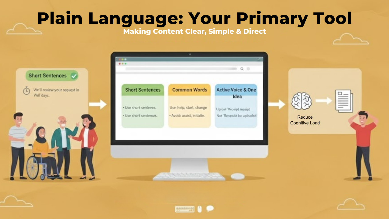
If you remember only one rule, make it this one: use plain language.
That means you:
Use short sentences
Pick common, everyday words
Say one clear idea at a time
Use These
Short, direct sentences
“We’ll review your request within 2 days.”Common, everyday words
Use: help, start, change, fix, get
Instead of: assist, initiate, modify, resolve, obtainConcrete, specific verbs
Use: download, pay, send, sign in
Instead of vague phrases: proceed with, facilitate, undertake, access your accountActive voice
“Upload your receipt” instead of “Your receipt should be uploaded.”One idea at a time
Avoid packing multiple steps or conditions into one sentence.
Avoid These
Technical or specialized jargon (unless absolutely necessary):
“Authentication token,” “API key,” “Tier-1 escalation”Corporate or overly formal language
“Kindly be advised that…” - “Please note…”
“In the event that…” - “If…”Ambiguous verbs or filler phrases
“Utilize” - “use”
“Proceed accordingly” - “follow the next steps”Long, stacked nouns
“User account information change request process” - “How to update your account info”
Plain language lowers cognitive load, which helps people process instructions even when they are tired, distracted, or not fluent in the language.
You are removing extra barriers so they can focus on the task, not the wording.
2. Structure your Content for Scanning
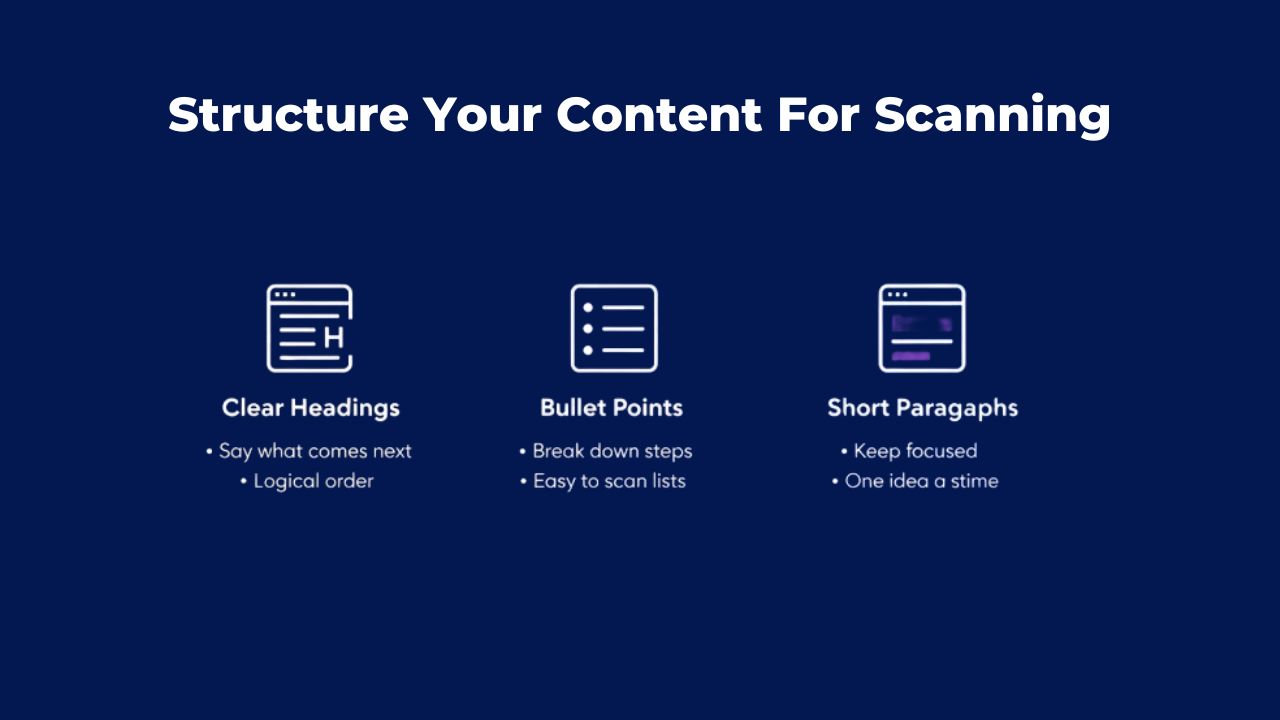
Most people do not read every line. They scan. So your job is to make key points easy to spot.
You can:
Use clear headings and some accessibility features that say what comes next
Break steps into bullet points
Keep paragraphs short and focused
When in doubt, ask yourself: could someone understand this section by quickly scanning the headings and bullets alone?
3. Give Users Context Right Where They Need It
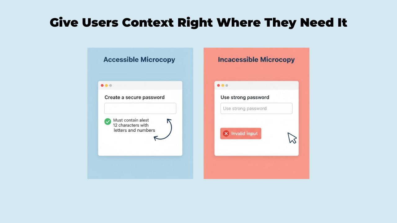
Good microcopy shows up in the right place at the right moment.
You help your users when you:
Put instructions before the field or action, not after
Keep important hints close to the input they relate to
Avoid hiding key details inside placeholders that disappear when typing starts
What this really means is that your user should not have to hunt around the page to remember what to do. The next step should sit right where their eyes or focus already are.
4. Make Labels and Links Self-Explanatory
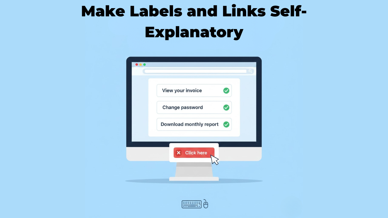
A common problem is vague labels like “Click here” or “Read more.” On their own, these do not say what will actually happen.
This is especially hard for:
Screen reader users who navigate from link to link
Keyboard users who tab through actions
Anyone scanning for a specific task
Instead, make the link or button text do the work. For example:
“View your invoice.”
“Change password”
“Download monthly report.”
Even if someone hears only that one line, they should still know what they are about to do.
5. Support Screen Readers and Non-Visual Navigation
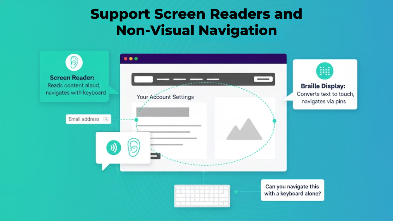
If your content only makes sense visually, a lot of people will struggle.
To support assistive technology, you should:
Avoid depending only on color or position to show status or meaning
Make sure each form field has a clear, connected label
Use headings in a logical order, so screen reader users can jump around the page easily
If a user can move through your page using just a keyboard and still understand every step, your structure is likely in good shape.
6. Write Error Messages That Actually Help
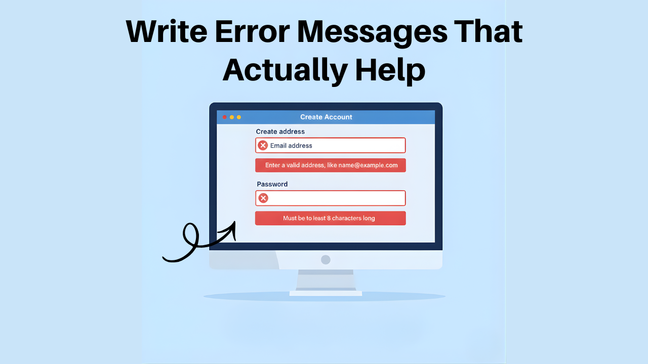
Error messages are often where people feel the most stress. A cold or vague error can make someone give up.
Strong, accessible error messages:
Say precisely what went wrong
Point to the specific field or step
Tell the user how to fix it
For example, “Enter a valid email address, like name@example.com” is more helpful than “Invalid input.”
You also want the error to be easy to find and read. Use clear color contrast and, if possible, text labels or icons, not just red as a signal.
7. Reduce Cognitive Load for Your Users
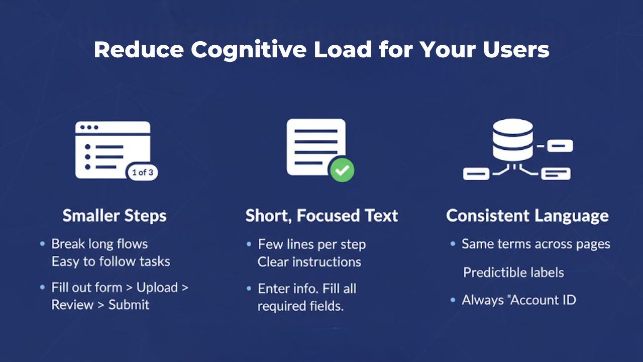
Cognitive load is the mental effort needed to understand and act. When it is too high, people lose track, feel overwhelmed, or make mistakes.
You can ease this by:
1. Breaking long flows into smaller steps
Instead of:
“Complete the form, upload your documents, review your details, and submit your application.”
Use:
Fill out the form
Upload your documents
Review your details
Submit your application
2. Keeping instructions to a few short lines per step
Instead of:
“To complete your registration, please provide all requested information accurately, ensuring that any mandatory fields are filled in before moving on to the next section.”
Use:
“Enter your information.
Fill in all required fields before continuing.”
3. Using consistent terms for the same idea across pages
Instead of:
Page 1: Account ID
Page 2: User Number
Page 3: Login Reference
Use:
Call it Account ID everywhere.
That is a big win for users with ADHD, brain fog, or memory challenges, and it also helps everyone move faster.
8. Use Inclusive, Respectful Language.
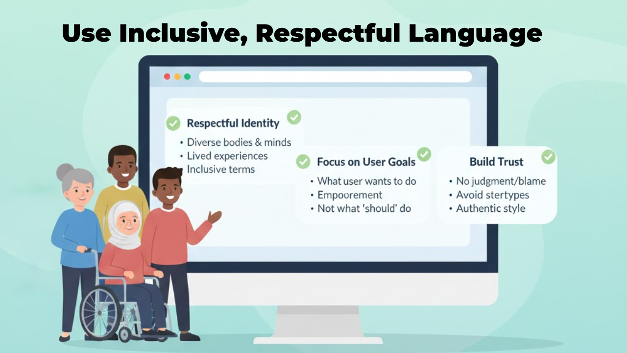
Inclusive content design is not only about structure. It is also about how you talk about people.
You can:
Avoid language that suggests pity or blame around disability
Steer clear of stereotypes about age, gender, or background
Focus on what the user wants to do, not what they “should” be able to do
If a user can read your content without feeling judged, mocked, or invisible, you are on the right track.
This is where ideas from inclusive content design blend well with accessible UX writing. You respect different bodies, minds, and lived experiences in the way you write.
9. Align Your Writing with Accessibility Standards
You do not need to know every line of the Web Content Accessibility Guidelines, but some principles are efficient for writing.
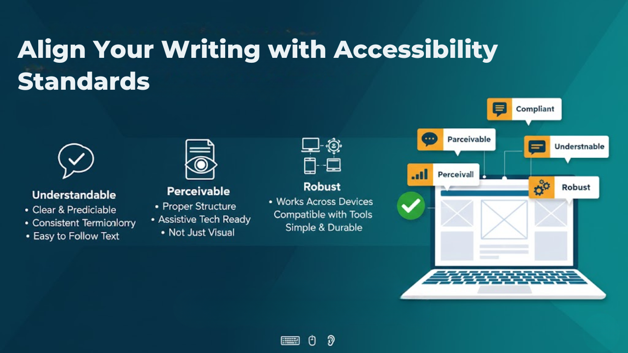
For UX microcopy, pay special attention to:
Understandable: Text should be clear, predictable, and consistent.
Perceivable: Content should be available to assistive tech users through proper structure.
Robust: Wording and structure should work well with different tools and devices.
What this really means is that your content should stand on its own in a simple, durable way.
10. Making Microcopy More Accessible
Make sure whatever you write is specific, action-focused, and easy to understand.
Here’s a simple look at how small changes can help.

Each “better” version is specific, action-focused, and easy to understand even out of context.
Practical Habits You Can Start Today
If you want to change how you write microcopy, start small but be consistent.
You might:
Read every button and link out loud in isolation. Ask, “Would I know what this does?”
Replace vague phrases with direct, concrete instructions.
Scan each page for long blocks of text and split them with headings and bullets.
When you explore what microcopy is, look up ux writing examples, avoid the temptation to just copy and paste from another product, and aim for an authentic style that fits your own users and your inclusive content design goals.
Over time, these small habits build an interface that feels calmer, clearer, and more respectful to everyone who uses it.
Bringing It All Together for Your Users
When you write accessible microcopy, you are not just polishing the interface. You are giving more people a fair chance to use your product without extra struggle.
You do this by using plain language, short and clear structure, helpful error messages, specific labels, inclusive language, and content that works well with assistive technology.
If you ever want deeper help with accessibility and content, teaming up with specialists such as Inclusive Web can give you expert guidance. At the same time, you stay focused on understanding your users and speaking to them with clarity and care.
Have Questions?
We Are Inclusive Web
We work with our clients to simplify digital accessibility to ensure your web and digital applications are ADA compliant and accessible to all your users. If you’d like to talk about your digital accessibility, you can email us at matthew@inclusiveweb.co, leave us a note here, or schedule a call here to discuss. Let’s make the web inclusive to all!