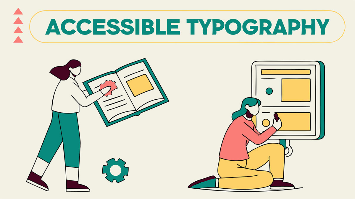
Accessible Typography & Font Guidelines for UI Designers
It is really challenging to read text that's too small, too light, or just not aligned well.
That's what happens when typography goes wrong. Millions of people struggle with poorly designed text every time they go online. Some can't see well. Others have dyslexia. Many are just trying to read on their phone while standing in bright sunlight.
Your job as a UI designer? Make sure everyone can actually read what you create. No fancy degrees required for this. You just need some wise choices and a bit of awareness about accessibility training for designers & typography guidelines.
This blog will discuss accessible typography tips and font guidelines for UI designers.
Picking the Right Accessibility Fonts
Choose Fonts That Are Easy to Read
Use sans-serif fonts like Arial, Helvetica, or Verdana. They’re clean, simple, and work well for most interfaces.
Avoid decorative or script fonts for body text. They may look nice in headers, but they’re hard to read in paragraphs, especially when letters touch or curl.
Check for Look-Alike Characters
Make sure your font clearly separates characters like l (lowercase L), I (uppercase i), and 1 (number one).
Also check O vs. 0. If they look too similar, choose a different font. This is especially important for users with dyslexia or vision challenges.
Consider Accessibility-Friendly Fonts
Fonts like Atkinson Hyperlegible and Lexend are designed for clarity and readability. You don’t have to use them, but they’re great options to explore.
2.Getting the Size Right
Use the Right Text Size
- Never go below 16px for body text. This is the minimum for comfortable reading. Many experts recommend 18-20px for content-heavy pages. Bigger text is easier to read, no one wants to squint.
Make Button Text Clear and Noticeable
- Buttons deserve extra care, especially critical ones like “Delete Account.”
- Start with 16px minimum, but don’t be afraid to go bigger so users instantly understand what they’re tapping.
Create a Strong Heading Hierarchy
- Your main heading should be clearly larger than your subheadings.
- This visual structure helps people quickly scan your page, and it’s especially helpful for users with screen magnifiers who only see small areas at a time.
3.Print Is Different
Don’t Forget Print Accessibility
- We focus so much on screens that print often gets overlooked, but things like forms, brochures, and manuals still matter.
Use Larger Font Sizes for Print
- Screen sizes don’t translate directly to paper. While 16px works online, printed body text should be at least 12pt, with 14pt being even better.
- People hold printed materials at different distances and can’t zoom in like they can on a device. Bigger text helps everyone.
Keep Contrast High
- Black text on white paper is the most readable option.
- Avoid gray text, low-contrast colors, or placing text over busy images. These choices may look stylish but create real barriers for people with vision challenges.
4.Spacing Changes Everything
Use Enough Line Spacing
- Tight line spacing makes reading difficult, people lose their place. Giving text more room makes it much easier to follow.
Follow the 1.5 Rule
- Aim for a line height of at least 1.5× your font size.
- For example, 16px text should have at least 24px line height.
- Most designers find 1.5 to 1.75 works well for comfortable reading.
Add Space Between Paragraphs
- Paragraphs should have more space between them than the line spacing inside the paragraph.
- This creates natural breaks and helps readers absorb information in smaller, manageable chunks.
Use Letter Spacing Carefully
- A little extra letter spacing can help some readers, especially those with dyslexia.
- But too much spacing makes words harder to recognize, use it gently.
5.Colors and Contrast
Make Sure Text and Background Colors Have Enough Contrast
- Your text must be readable against its background, this is not optional.
Follow Contrast Ratio Standards
- Normal text should meet a 4.5:1 contrast ratio.
- Large text needs at least 3:1.
- These numbers are based on research about what people with vision impairments can reliably see.
High Contrast Doesn’t Mean Harsh Colors
- You don’t need pure black on bright white.
- Dark gray on off-white often looks better and still passes accessibility rules, just be sure to test it.
Never Rely on Color Alone
- Don’t use only color to show important information.
- An error message shouldn’t be only red, add an icon or text label.
- Links shouldn’t rely on color alone, use underlines or another clear indicator.
Use a Contrast Checker
Tools like WebAIM’s contrast checker or built-in browser tools can verify if your colors meet requirements. Learn about some web Accessibility testing tools.
Don’t guess, test your color combinations.
Avoid Putting Text Over Images
- Text on images is usually hard to read.
- If you must do it, add a solid background behind the text or use a dark overlay on the image to improve clarity.
6.When Text Shows Up in Images
Be Careful When Placing Text Inside Images
- Social posts, banners, and infographics often include text, but this creates accessibility issues.
Screen Readers Can’t Read Text in Images
- Text baked into an image can’t be read aloud, resized, or recolored.
- Use real HTML text whenever possible so users can adjust it to their needs.
Provide Proper Alt Text
- If you must use text in images, include alt text that contains all the written content.
- For complex visuals (like infographics), offer the same information in a fully accessible format elsewhere on the page.
Make Text Bigger and Higher Contrast
- Text in images should be larger and more contrasting than normal text because it’s harder to read.
Keep Line Length Comfortable
- Aim for 45-75 characters per line.
- Lines that are too long make readers lose their place; lines that are too short create a choppy, tiring reading experience.
7.Different Parts Need Different Approaches
Make Navigation Text Clear
- Menu text should be instantly understandable.
- Use at least 16px, give items enough spacing, and ensure strong contrast.
- Avoid ALL CAPS for long menu items, they’re harder to read.
Write Helpful Button Text
- Button labels should say exactly what happens: “Submit” is clear; “Click here” is not.
- Keep button text at least 16px, and go larger for important actions.
Design Accessible Form Labels
- Place labels right next to the fields they describe.
- Use simple, direct wording.
- Ensure labels are large and dark enough to read easily.
- Never rely on placeholder text alone, it disappears when users start typing.
Make Error Messages Clear and Specific
- Use color, icons, and placement together so people don’t miss errors.
- Be specific:
- Poor: “Invalid entry.”
- Helpful: “Please enter a date in MM/DD/YYYY format.”
Don’t Shrink Supporting Text
- Even small helper text must be readable.
- Avoid tiny, light gray text (like 11px).
- People shouldn’t need perfect eyesight to understand important details.
8.Making It Work on Every Device
Design Typography That Works on Every Device
- People read your content on phones, tablets, laptops, and desktops, your typography must adapt to all of them.
Use Relative Units
- Avoid fixed pixel sizes.
- Use relative units (like em, rem, or percentages) so text scales with user preferences.
- If someone increases their browser’s default font size, your design should adjust automatically.
Maintain Consistent Size Relationships
- Let text scale for different screen sizes, but keep the hierarchy clear.
- Body text might be slightly smaller on mobile, but headings should stay proportionally larger.
Test on Real Devices
- Something that looks great on a large monitor may be hard to read on a phone.
- Check line lengths, spacing, and text size on multiple devices to ensure everything adapts properly.
Consider Viewing Distance
- People hold phones closer than desktop screens.
- This means you may use slightly smaller text on mobile while still keeping it readable.
9.Mistakes to Avoid
Using Text Smaller Than 14px
- Anything below 14px becomes unreadable for many users.
- There’s almost never a good reason to go that small.
Setting Line Height Too Tight
- A line height of 1 or less makes text feel cramped and tiring.
- Always give lines enough space to breathe.
Skipping User Testing
- Contrast tools are useful, but they can’t tell you if your font works for people with dyslexia or if your spacing helps readers follow lines.
- Testing with real users is essential.
Relying on Thin or Light Font Weights
- They may look stylish in a design mockup, but they’re harder to read in real use.
- When in doubt, choose a slightly bolder weight.
Blocking Text Zoom or Custom Stylesheets
- Some users need to resize text or override your styles.
- Don’t restrict these options, design with flexibility in mind.
Assuming Bigger and Bolder Means Accessible
Accessibility isn’t about making everything huge or loud. Check some Accessibility Practices for Designers.
Aim for balanced, readable, adaptable typography instead of overwhelming text.
10.Test Your Work
Use Browser Tools to Check Contrast
- Built-in developer tools can quickly flag color contrast issues so you can fix them early.
Zoom to 200% and Check the Layout
- Many users browse at high zoom levels.
- Make sure text is still readable and nothing breaks, overlaps, or becomes impossible to use.
Try a Screen Reader
- Navigate your page with a screen reader to see whether your heading levels and text structure make sense without visuals.
- This reveals problems you might miss by sight alone.
Get Feedback From Real Users
- People with different needs, low vision, dyslexia, cognitive differences, will notice things you won’t.
- Their feedback is more valuable than any automated checklist.
The Bottom Line
Good typography isn't about following rules because someone said so. It's about making sure everyone can actually use what you design.
Start with the basics, pick readable fonts, use sizes people can see, and make sure there's enough contrast. Give text room to breathe. Then test with real people using real assistive technology.
We at Inclusive Web get that accessibility compliance isn't just about checking boxes. It's about building things that actually work for everyone. Their approach of combining expert audits with real user testing shows what good accessibility looks like in practice.
Make those choices count. Design text that everyone can read.
Have Questions?

We Are Inclusive Web
We work with our clients to simplify digital accessibility to ensure your web and digital applications are ADA compliant and accessible to all your users. If you’d like to talk about your digital accessibility, you can email us at matthew@inclusiveweb.co, leave us a note here, or schedule a call here to discuss. Let’s make the web inclusive to all!