Key Accessibility Features Every Education Website Needs
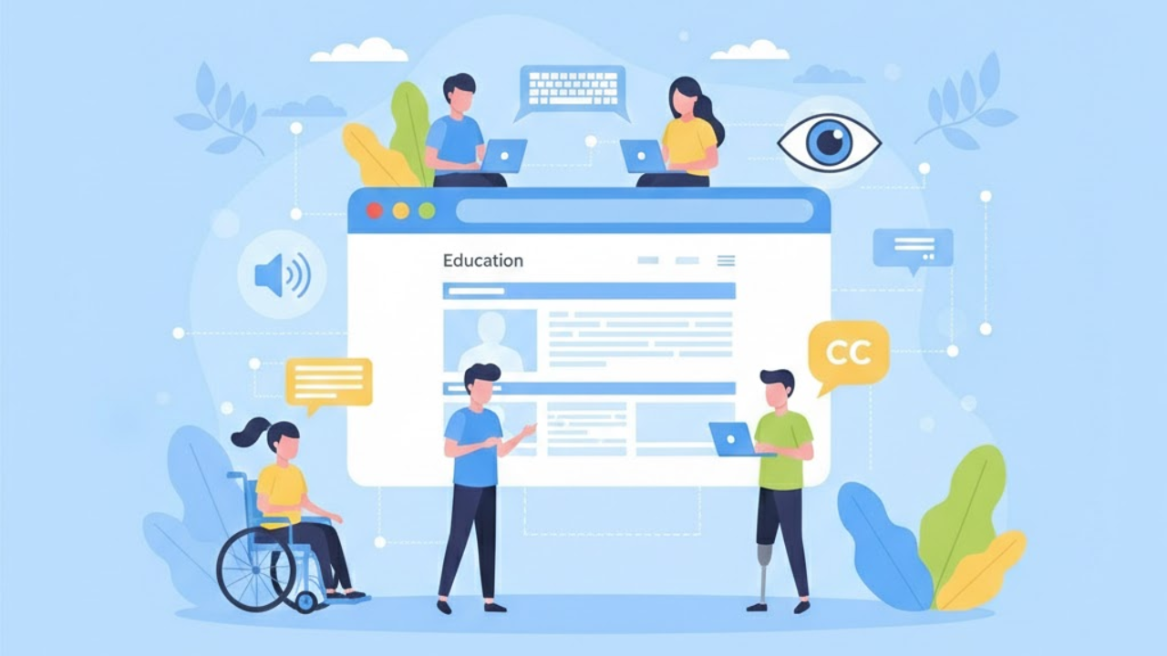
Education websites are no longer just “nice to have” tools. They are where people learn, enroll, pay fees, find help, and stay informed.
And many people depend on them in ways we do not always see.
In the United States, 7.5 million students ages 3–21 were served under IDEA in the 2022–23 school year.
That is one reason accessibility in education matters so much. If a website blocks someone from reading a lesson, filling a form, or finding support, it can block real learning.
This article explains what to build and what to fix to improve accessibility.
What Website Accessibility Means In Education
Website accessibility means your site works for people with different needs. It means:
A student can use a screen reader to navigate a course page.
A parent can complete an enrollment form using only a keyboard.
A staff member can read important updates even on a small phone screen.
Accessibility is not one single feature. It is a group of choices that removes barriers.
When people search for accessibility features for websites, they usually want a clear checklist. Education websites need that checklist too. But they also need extra care in areas like portals, calendars, documents, and learning tools.
The Standards That Shape Accessibility Expectations
You do not need to memorize laws or technical rules. But understanding the basics helps shape what people expect from education websites.
WCAG Is The Main Accessibility Guide
WCAG (web content accessibility guidelines)is a set of guidelines that explains how to make web content more usable for people with disabilities. WCAG 2.2 is the latest version and includes new success criteria.
ADA Title II Rule Matters For Public Education
In April 2024, the U.S. Department of Justice published a final rule for state and local governments that sets technical requirements for accessible websites and mobile apps.
Many public education institutions fall into this world, because they are part of state or local government services.
Section 508 Often Shapes Procurement And Tools
Section 508 applies to federal agencies and requires accessible electronic and information technology.
Even when a school is not a federal agency, Section 508 practices often influence the tools schools buy and the standards vendors are asked to meet.
The Core Accessibility Features Every Education Website Needs
The items below are the foundation. If you get these right, your website becomes easier for everyone, not only people with disabilities.
Clear Page Structure With Headings
Headings should follow a clean order.
One main page title at the top
Clear section headings
No random heading jumps
This helps screen readers and also helps people who skim.
A Skip Link For Faster Navigation
A skip link lets keyboard users jump past repeated menus.
This is important on education sites because menus can be long. Many pages also have alerts, banners, and multiple navigation bars.
Full Keyboard Support For Every Action
A person should be able to:
Open menus
Close popups
Use filters
Submit forms
Move through sliders and tabs
All without using a mouse.
If something cannot be done with a keyboard, it is a barrier.
Visible Focus So People Can See Where They Are
When someone tabs through a page, they need a clear outline of focus.
If the focus indicator is missing, faint, or hidden under sticky headers, users get lost.
Strong Color Contrast And Clear Text
Text should be easy to read.
Use strong contrast for text and buttons
Do not rely on color alone to show meaning
Make error messages clear with words, not only red borders
Many sites call these basics “website accessibility features,” but they are often missed in real education templates, especially in busy navigation areas.
Text That Can Resize Without Breaking The Page
People zoom in for many reasons.
Your site should still work when the text is larger.
No cut-off text
No overlapping buttons
No missing content
Images With Helpful Alternative Text
Alt text should explain the image's purpose.
If an image is decorative, it should not distract screen readers
If an image contains essential information (like a flyer), that information must be available as text
School sites often post posters, event flyers, and announcements as images. That is a common accessibility problem.
Video Captions And Useful Transcripts
Education websites use video a lot.
Announcements
Class updates
Recorded sessions
School board meetings
Campus tours
Captions help deaf and hard-of-hearing users. They also help people in noisy places and people learning a new language.
Transcripts help people who prefer reading or who cannot play audio at the moment.
Forms That Are Easy To Complete
Education websites have many forms:
Admissions
Registration
Contact
Financial aid
Event signups
Volunteer forms
Forms need:
Clear labels for every field
Helpful instructions
Errors that explain what went wrong and how to fix it
A clear success message after submission
These are accessible features that reduce frustration for everyone, especially
when forms are long.
Links That Make Sense Without Extra Context
Avoid links that say “Click here.”
Instead, use link text that explains where the link goes.
This matters on school sites because pages often include many downloads and many “read more” links.
Tables Used The Right Way
Tables should be used only for real data, not for layout.
If you use tables for schedules, menus, or calendars:
Use clear headers
Keep the layout simple
Avoid merged cells when possible
WCAG 2.2 Updates Education Websites Commonly Miss
Many education sites were built around older templates. Newer standards highlight the problems those templates create.
WCAG 2.2 adds success criteria that affect standard educational layouts, such as sticky headers, mobile menus, and portal logins.
Here are the updates that often become real pain points.
Focus Should Not Be Hidden By Sticky Content
Sticky headers, cookie banners, and chat bubbles can cover the focused item.
WCAG 2.2 includes “Focus Not Obscured” to address this.
In education, this often happens on:
Mobile menus
Announcement bars
Portal dashboards with fixed toolbars
Small Buttons Should Not Be Hard To Tap
WCAG 2.2 includes “Target Size (Minimum).”
Education sites often have tiny targets like:
Calendar arrows
“Download PDF” icons
Close buttons on popups
If buttons are too small, many people struggle, including those with limited motor control and those using small screens.
Dragging Should Have An Alternative
WCAG 2.2 includes “Dragging Movements.”
If your page uses drag-only actions, offer a simple alternative.
Examples on education sites:
Sliders that only move by dragging
Carousels that only scroll by dragging
“Arrange items” tools with no keyboard alternative
Logins Should Not Require A “Trick” That Blocks Users
WCAG 2.2 includes “Accessible Authentication (Minimum).”
Education portals often use login steps that confuse or block users, such as certain visual puzzles or unclear verification flows.
The goal is simple. People should be able to sign in without needing a specific ability.
Help Should Be Consistent Across Steps
WCAG 2.2 includes “Consistent Help” and “Redundant Entry.”
This is very relevant to admissions and enrollment.
If the same help link exists on one step, it should exist on other steps too.
If a person has already entered information, do not force them to re-enter it repeatedly.
Education Pages That Need Special Accessibility Attention
General checklists are helpful. But education has special page types that competitors often ignore or barely explain.
Below are the most critical areas to audit.
Admissions And Enrollment Pages
These pages often include:
Multi-step forms
File uploads
Deadline notices
Eligibility rules
Payment steps
Key needs:
Clear step labels
Strong error messages
Accessible file upload controls
A way to save progress if the process is long
This is where Accessibility features for education websites matter the most, because these flows decide who can apply and who can complete the process.
Course Catalogs And Program Pages
Course pages often use filters, search tools, and expandable sections.
Make sure:
Filters work with keyboard navigation
Search results are announced clearly (especially for screen reader users)
Expand/collapse sections are accessible
“Apply now” and “Request info” buttons are easy to find and use
Student And Parent Portals
Portals are high-use and high-stress.
If a portal is unavailable, it can prevent a student from checking grades, accessing homework, or reading messages.
Key areas:
Clear navigation labels
Accessible charts and progress indicators
Notifications that can be read by assistive technology
No timeouts that happen without warning
Calendars, Events, And Schedules
Interactive calendars are one of the most common accessibility failures.
A safer approach is:
Offer both a calendar view and a list view
Provide clear “next” and “previous” controls that work with the keyboard
Make event details readable and not hidden behind hover-only actions
PDFs, Flyers, And Download Centers
Education sites publish many documents:
Handbooks
Policies
Permission slips
Lunch menus
Meeting minutes
If documents are not accessible, many users cannot read them.
Helpful steps:
Publish important content as web pages when possible
If you must use PDFs, ensure they are tagged, readable, and searchable
Label links clearly (example: “Student Handbook (PDF)”)
Emergency Alerts And Closures
Emergency messages must be easy to notice and easy to understand.
Key needs:
High contrast
Clear wording
Works on mobile
Does not trap keyboard focus
Screen readers can recognize the alert quickly
Third-Party Tools Can Break Accessibility
Many education websites embed tools from other companies.
Examples include:
Learning management systems
Payment systems
Ticketing tools
Chat widgets
Appointment scheduling
Survey tools
Even if your primary site is clean, a single inaccessible embedded tool can create a barrier.
A simple vendor checklist helps:
Ask if the tool supports WCAG alignment
Ask what testing is done and how often
Ask how accessibility issues are reported and fixed
This is a key part of the Education website accessibility features, because education sites rely heavily on outside platforms.
Testing That Finds Real Problems, Not Just “Tool Scores”
Automated tools are helpful. But they do not catch everything. That is why must-have tools for testing web accessibility should always include real testing with assistive technology.
Even Inclusive Web notes that true accessibility cannot be validated by automation alone and highlights the value of testing with assistive technology users.
A balanced testing approach usually includes:
Automated Checks
These can catch:
Missing alt text
Some contrast issues
Basic structural problems
Manual Checks
Manual checks catch issues that tools miss:
Keyboard traps
Focus getting lost
Confusing navigation order
Popups that cannot be closed
Unclear error messages
Real User Testing With Assistive Technology
This finds practical barriers that are hard to predict.
For education, this matters because real users will tell you what blocks:
Enrollment steps
Portal tasks
Course browsing
Downloading and reading documents
Accessibility Is Not A One-Time Fix
Education websites change constantly.
News updates
Staff changes
Event announcements
New PDFs
New tools added to the site
That is why ongoing monitoring is essential. Inclusive Web describes monitoring as a way to catch issues caused by content updates, platform changes, and deployments over time.
Even if you do not use a monitoring service, you can still build a simple habit:
Check key pages after every major update
Review forms monthly
Test new plugins and widgets before publishing
This is how Key accessibility features for education websites stay in place instead of fading over time.
A Simple Accessibility Statement And A Clear Internal Policy
Many education websites add a link in the footer that explains their accessibility efforts.
An accessibility statement is usually public-facing.
A policy is often internal and guides how the organization builds and maintains accessibility.
Inclusive Web explains that an accessibility statement is intended for users, while a web accessibility policy is designed for internal use.
For education websites, a strong statement often includes:
A plain-language commitment to accessibility
Known limitations (if any)
A way to report an issue
A promise of response and support
A strong internal policy often includes:
Who approves new tools
How content is published
What “done” means for new pages
What testing is required
Conclusion
Education websites serve entire communities. So accessibility is not optional. It is part of doing the job well. When you build with clear structure, full keyboard support, readable content, accessible forms, and safer modern patterns, more students and families can use your site without extra help.
If your team wants deeper guidance on audits, monitoring, and real-user testing, Inclusive Web is one place that publishes practical accessibility resources you can learn from.
Have Questions?
We Are Inclusive Web
We work with our clients to simplify digital accessibility to ensure your web and digital applications are ADA compliant and accessible to all your users. If you’d like to talk about your digital accessibility, you can email us at matthew@inclusiveweb.co, leave us a note here, or schedule a call here to discuss. Let’s make the web inclusive to all!


